Into The Groove
ARCHITECT Mountford McCarey Architects • INTERIOR DESIGN Malvina Stone • PHOTOGRAPHY Jody D’Arcy • STORY Elizabeth Clarke
The exterior of Dalkeith house includes large glass DGA Windows and fine edged cedar screening that refines the façade and draws light deep into its interior spaces.
Sunlight plays a pivotal role in architect Ben Mountford’s design process. "Natural sunlight is important to address in terms of shade, shelter and heating as well as from a creative perspective,” he says. “It's the low angle sun we love. The Western Australian sun is an important material for us."
For Dalkeith House, sunlight and site informed his composition of simplistic interiors. Wide open to lush green gardens, each space is also private and future-oriented for its growing family.
"In Dalkeith, there is a history or experimental architecture, and this too is a very different house," Ben tells Havenist. "It's very open to the outside, and from the front creates a memorable picture for the passer-by."
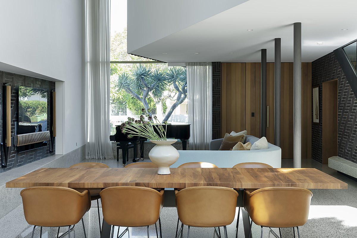
The main living room offers a direct sense of connection with the gardens through the vast sliding glass doors. Above the Cosh Living dining table and Muuto chairs from Living Edge is a UFO LED brass chandelier from Lucretia, Melbourne.
Bowral Blue bricks are laid geometrically forming a stunning and graphic backdrop for dining.
Sheer drapes by Unique Fabrics filter sunlight into the living space. A large glass window frames a baby grand piano on one side and a tree on the other.
The glass slider provides access to the garden. In winter, an Escea, DFS730 Freestanding Gas Fireplace warms the space.
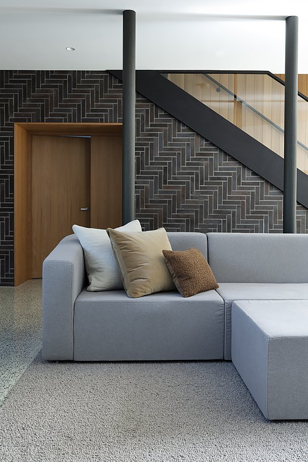
A custom made couch in walnut and felted wool is artfully styled with cushions by James Dunlop Textiles covered in velvet from Zepel Fabrics.
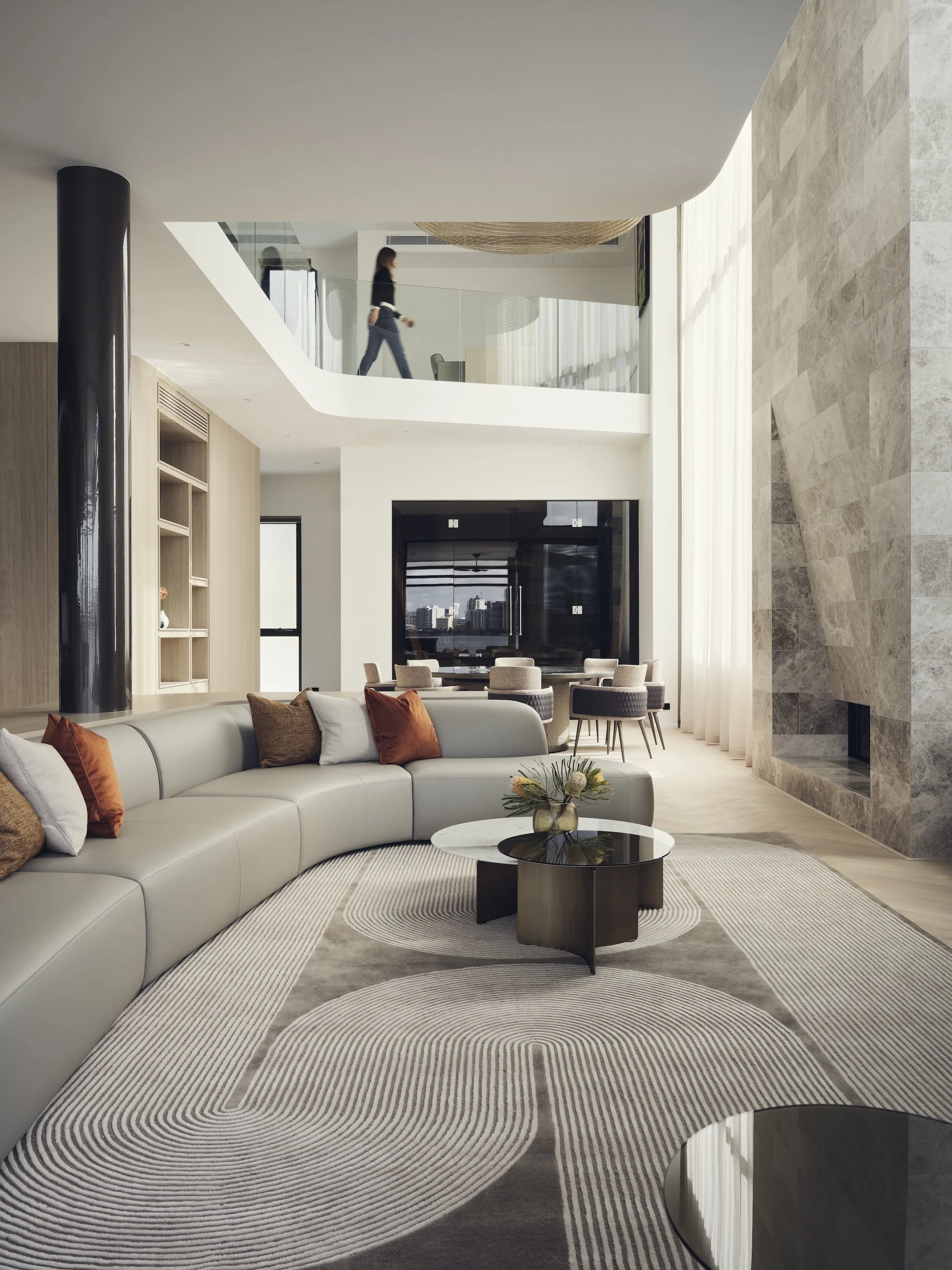
The home’s natural colour palette allows its lush green outlook and plantings by Studio 634 Landscapes to take centre stage. Carefully placed furniture subtly zone the open floorplan.
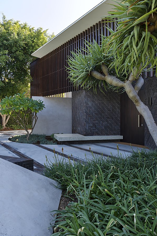
Herringbone brick, fine timber screening and glazing combine with a delicate concrete frame, creating a sense of depth and privacy whilst embracing the sunlight. In place of a front path or fence, a green break separating the home from the street references Australia's iconic suburban driveway-lawn configuration, and a built-in bench acts like a park bench. Lush landscaping frames the house, while a landscaped rim provides privacy and a striking entrance.
Inside, the floor plan is just as uncomplicated: a master suite, bedrooms, a bathroom and rumpus room are upstairs, and a combination living kitchen and dining space and guest quarters downstairs.
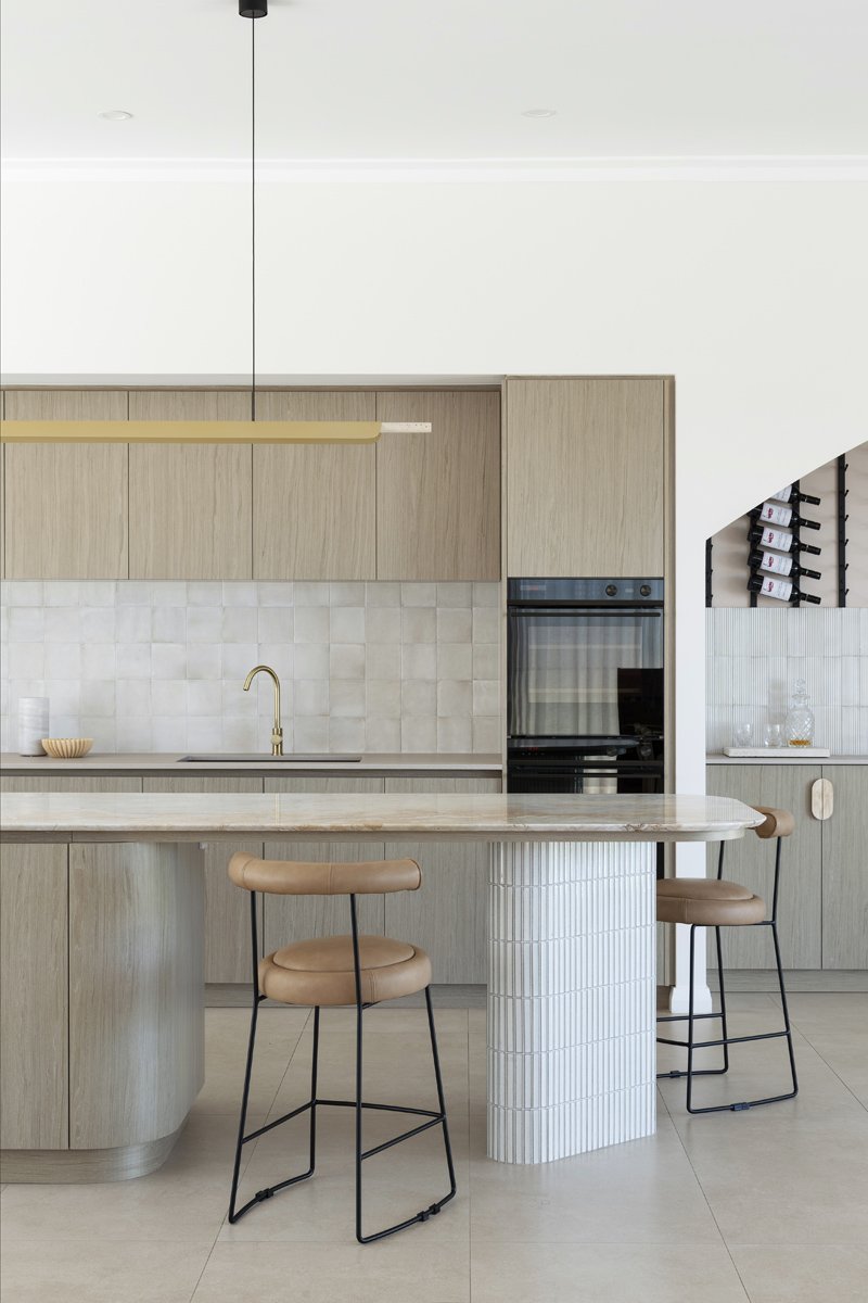
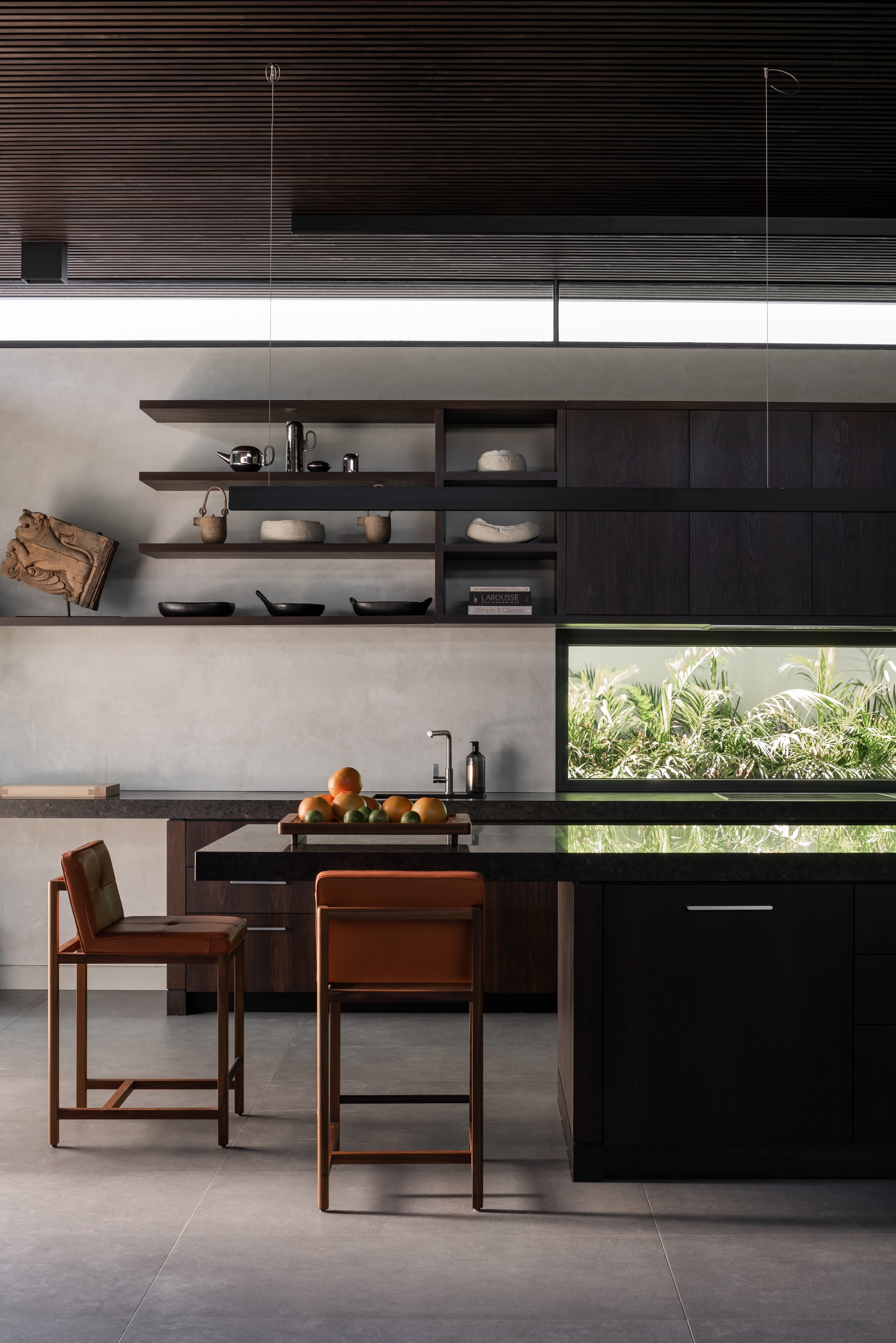
The kitchen benefits from floor-to ceiling windows overlooking the garden and is largely defined by the feature brick wall. The polished plaster to concrete walls are by The Polished Plaster Company and white concrete Essa Stone lines the benchtops.
A simple organic vase from Loam provides impact in the kitchen.
Polished concrete flooring by Holcim is carried through the house. It gently meshes with other finishes including Western red cedar shiplap boards that line the kitchen island bench and staircase.
A square of carpet by Carpet Force Claremont acts as a pause, zoning and softening the family’s living space.
In the foyer, a built-in ledge acts as a drop zone and gallery space for children’s artworks.
The impression of quality is immediate, with its simplistic design and elements displaying high craftsmanship and natural materials. With every square metre thoughtfully planned to enhance the impression of space, the level of detail is impressive.
Most outstanding is the face brickwork that flows throughout the house connecting it with the outside. Made from blue Bowral Bricks arranged in a herringbone pattern, they feature on the front façade and throughout the lower level of the house.
"Too much brick inside can feel too 1970s, so we used it as a lovely detail with just the right amount of application to provide a dynamic finish," he says.
Mock-ups were constructed to ensure suitability for use in the more complex forms found in the house's interior, like in and around the fireplace. The resulting geometry speaks of high craftsmanship and fills the spaces with warmth and scale. Its sheen and pattern speak to elements like the bespoke steel fireplace and timber panelling, providing the home with an earthy ambience.
The kitchen, living and dining spaces overlap, making the home feel extra spacious. Thoughtfully designed built-in storage and an open mezzanine level provide service space while concealing the inevitable mess of everyday family life. Features like the fireplace, flue and casing are cleverly scaled in for a seamless appearance, paying strength to the space. "Movement though the home is well choreographed around crafted details of bricks, volume and double height," he explains. "The home is basically a box with angles and landscaping that create circulation and guide people through.”
In the bedroom, the drapes are by Allusion, carpet is by Carpet Force Claremont, and layers of Bed Threads linens are from Loam.
The bathroom has a restrained sense of simplicity and elegance with its Eveneer walnut vanity, Rogerseller peach graphite tapware and Kaldewei Cono washbasin. The wall tiles by Original Ceramics contrast dramatically with the Graphite Matte Original Ceramics on the floor.
A built-in seat acts like a park bench, enticing neighbours in for afternoon chats. Lush sculptural plantings by Studio 634 Landscapes soften hard edges.
A raised grass plane allows for a transparent façade, and street walk inspired paving using Holcim colour concrete surrounds the home.
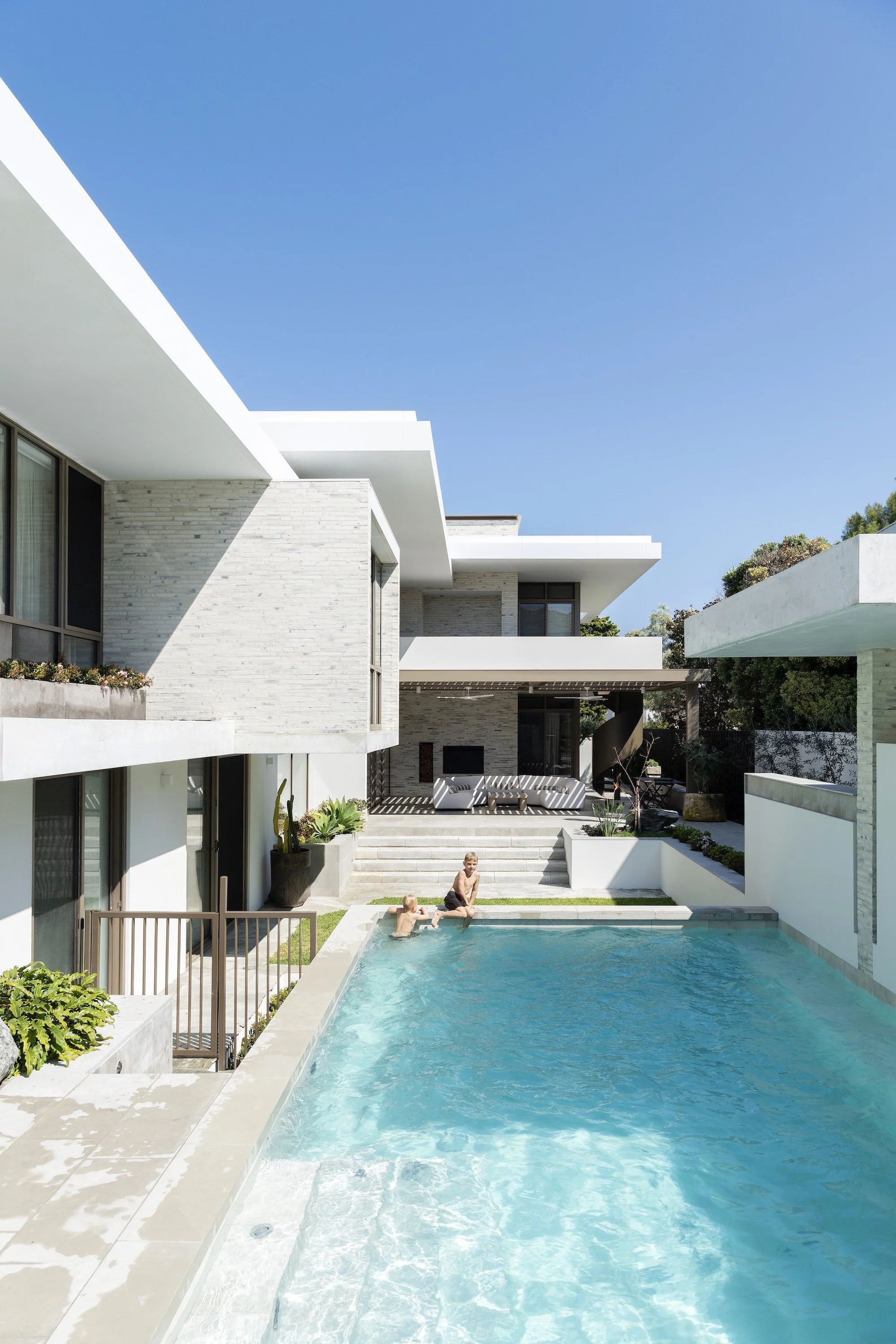
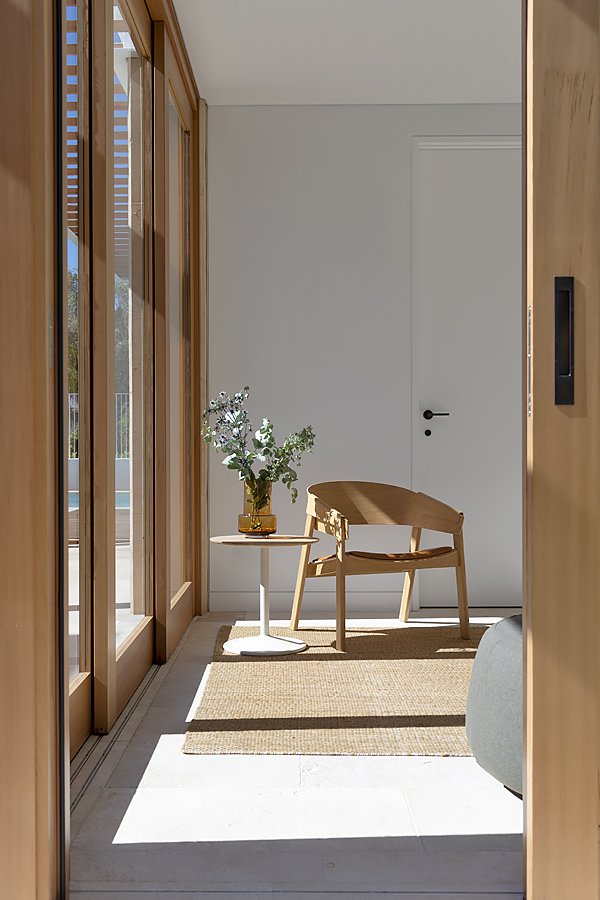
The real star of the home lies at the back of the house. Vast engineered glass sliding doors that open entirely from the open plan living space to the garden are concealed within the structure. When opened up, the family can move fluidly between the house and garden. Imported from Germany, it took three days for installers from Melbourne to fit them and ensure they worked seamlessly. "They are cumbersome, so it was crucial they worked perfectly so even a young child can operate them," he says. When closed, they give the appearance of a huge wall constructed entirely of glass and provide the ground floor with a rich green outlook. "Opening up to the north-facing garden means there is plenty of warmth and sunlight," he says. "It's a home that sits comfortably within the landscape and is a sophisticated yet casual living environment for all to enjoy."


