Restored Faith
INTERIORS Lisa Quinn-Schofield • PHOTOGRAPHY Jody D’Arcy • STORY Elizabeth Clarke
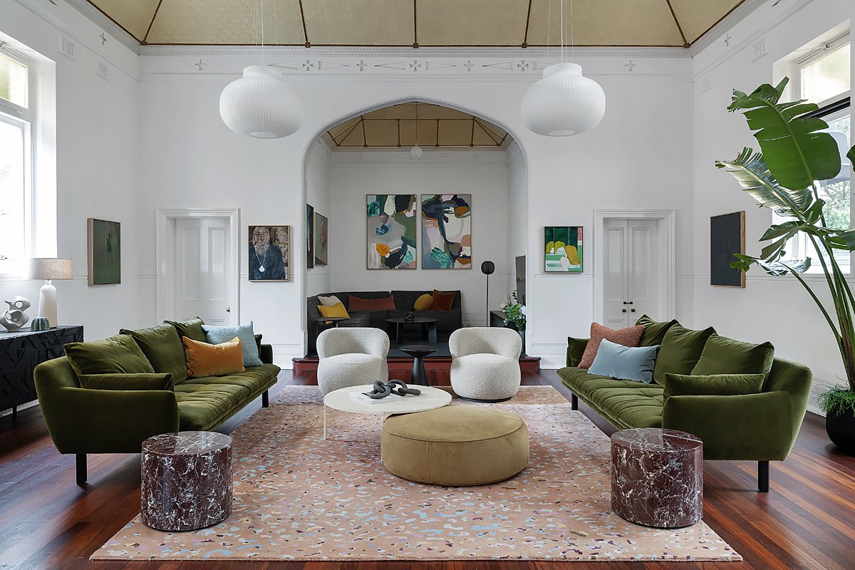
Applying a considered mix of materials, texture, colour and shapes, Lisa’s selections subtly mirror the curves and details in the church’s architecture.
Muuto strand pendant, Arrival Hall; artwork centre back wall, Anya Brock; Bloom floor lamp, District; MARZ Designs Attalos pendant light; Ethnicraft corner sofa, Kartique; Andy sofa, Joy occasional chairs, Alice coffee table, Leo blush rug, selection of cushions + lamp on buffet, Jardan; Graphic buffet, Ethnicraft; ceramic sculpture on buffet, Emma Lindegaard Studio; small sculpture on buffet, Natalie Rosin; portrait of woman, Stanislas Pechaczek; black side table, Rosa Brown Agencies; Ottoman, Granite Lane; marble side tables, GlobeWest; black portrait, Daniela Dlugocz; green portrait, Emily Ten Raa.
Lisa Quinn-Schofield’s church project in Subiaco is a fabulous modern family haven housed in a heritage 1900s brick church. The original Aloysius' Convent School-Church is of considerable significance for the City of Subiaco. Built in 1908, it was a stand-alone school church that later became a school and local mass and community centre.
The designer was approached to breathe new life into its original bones with clever interventions that showcase the juxtaposition of the new and the old. "It had complete wow factor from its soaring decorative ceilings and quaint spiral staircase to elegantly arched doors," she says. "I couldn't wait to get started."
The curvy black dining table provides a striking canvas for a collection of Dinosaur Design vessels.
Dining table, GlobeWest; dining chairs, Empire Home; vase, Dinosaur Designs from Jardan.
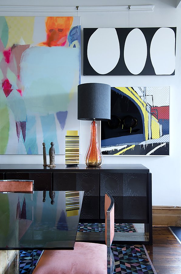
A strong theme with a palette of white, black and forest green allow stunning art to shine. Timber, velvet and marble add depth and interest.
Andy sofa, Leo blush rug, selection of cushions + lamp on buffet, Jardan; Graphic buffet, Ethnicraft; ceramic sculpture on buffet, Emma Lindegaard Studio; small sculpture on buffet, Natalie Rosin; marble side tables, GlobeWest; mirror, District.
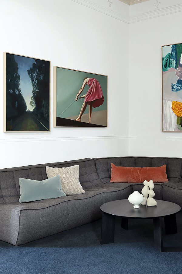
The owner’s eclectic and colourful art collection served as inspiration for Lisa’s choice of colours and furnishings.
Ethnicraft corner sofa + coffee table, Kartique; left painting, Emily Ten Raa; right painting, Indra Geidans; round vase, Emma Lidegaard Studio; sculpture, Kura Studio.
A patterned rug from Jardan provides an interesting first layer for all types of art and furnishings.
Muuto strand pendant, Arrival Hall; artwork centre back wall, Anya Brock; Bloom floor lamp, District; MARZ Designs Attalos pendant light; Ethnicraft corner sofa, Kartique; Andy sofa, Joy occasional chairs, Alice coffee table, Leo blush rug, selection of cushions + lamp on buffet, Jardan; Graphic buffet, Ethnicraft; ceramic sculpture on buffet, Emma Lindegaard Studio; small sculpture on buffet, Natalie Rosin; portrait of woman, Stanislas Pechaczek; black side table, Rosa Brown Agencies; Ottoman, Granite Lane; marble side tables, GlobeWest; green portrait, Emily Ten Raa.
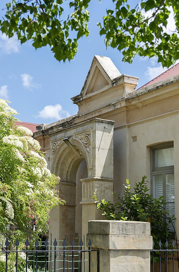
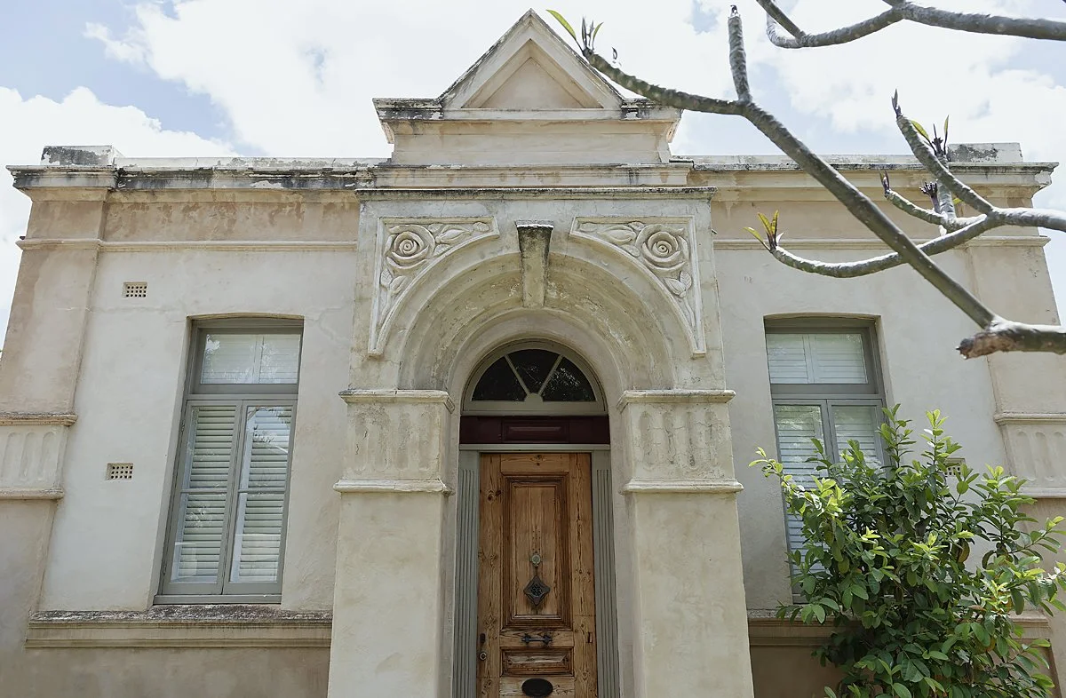
Designed as a simple hall in Federation style, the original rectangular floor plan is simple in design and constructed of rendered brick. Its steeply pitched roof houses soaring ceilings, and a front façade and entrance porch are decorated with classical detailing and moulded flower motifs. Using a considered selection of materials and a simple colour palette, Lisa enriched the home with a contemporary feel and sense of its original meaning – a haven of peace and tranquillity.
Lisa found the building in good shape structurally, and the interior was beautifully intact thanks to a renovation by its previous owners. Her scope of work was focused inward and largely on the ground floor – a sunlit open plan space embracing living and dining rooms and a kitchen with access to the bedrooms and bathroom. A television room is located on an elevated platform, and a spiral staircase leads to a home office on the mezzanine level.
Objects of various height and scale take advantage of the capacious height of the original church.
Dining table, GlobeWest; dining chairs, Empire Home; vase, Dinosaur Designs from Jardan; wall light, MRZ Designs.
Sunlight pours in from skylights and vast glass windows and doors, illuminating the family’s living spaces.
Dining table, GlobeWest; dining chairs, Empire Home; vase, Dinosaur Designs from Jardan.
The original timber floors were restored lending a feeling of calm and tranquillity to the space.
Sofa, Innerspace; greenery, Bar Botanik; artwork, Belinda Wiltshire; rug, GlobeWest.
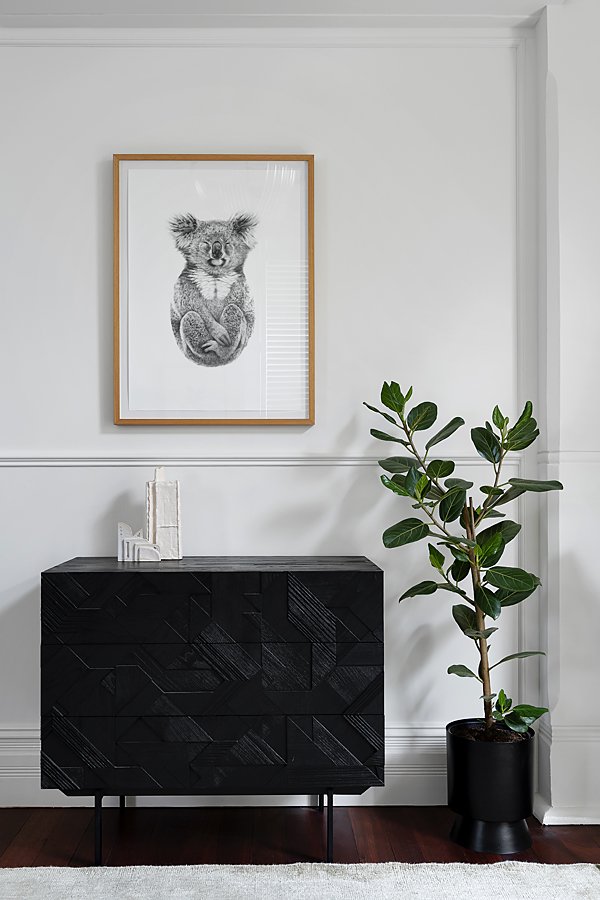
The coupling of a black side table and whimsical print form an eye-catching vignette.
Koala artwork, Carla Fletcher; drawers, Ethnicraft; small sculpture, Natalie Rosin; large sculpture, Loam; greenery, Bar Botanik.
Tweaks and adjustments were made, like restoring the original floorboards, bricking up a door area, and relocating a trap door to the underground cellar. The walls were basted in white, allowing the existing architecture to shine. Drawing inspiration from the owners' art collection provided Lisa with a strong starting point for her selections.
"Art is often an afterthought," she says. "It's not often at the forefront of decision making."
Stunning soaring ceilings allowed Lisa to experiment with size and scale but presented some challenges. "Installing lighting was difficult because the ceilings were high, so it needed to be large yet accessible in height," she says. "The ceilings made the open plan space appear larger than it is, and with no usable walls, the furniture needed to float symmetrically in the middle of the room."
The result is cosy and stylish interiors that celebrate the charm of the original structure. "I like to create interest in my projects with a mix of materials, colours and shapes," she says. "I wanted to mirror the curves of the arches with items 'artful' in design."
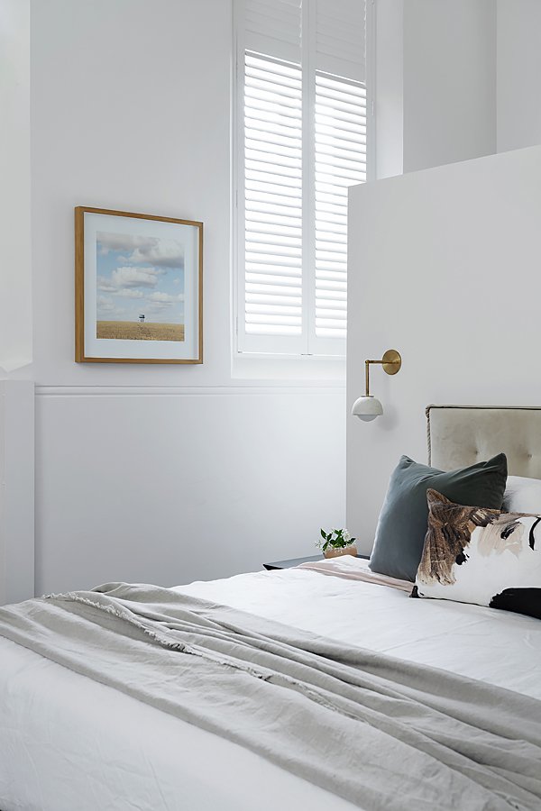
Every detail matters here, from the custom bed and side tables to the decorative pillows and cosy throws. Lisa’s soothing yet eye catching colour combination brings the space to life.
Artwork, Christian Fletcher; lights, MARZ Designs; Bed + side tables, Arthur G; cushions, sage Jardan; patterned cushion, Hawtrey; bedding, Bedtonic.
A Globewest coffee table in the master suite serves as a mighty foundation for soft pastels and nuanced naturals.
Coffee table, GlobeWest; Mette Ditmer spikey black bowl.
Sourcing pieces from local designers have created spaces that are cohesive yet eclectic. "I'm a big fan of local, especially Jardan that is Australian made, sustainable, customisable and cool," she says.
The main bedroom is the ultimate 'adult retreat' with a custom-designed bed base, contemporary wall lights, and delicate works of art on the walls. A wardrobe is concealed behind the bed, and a small lounge area continues a sense of luxury.
Lisa utilises the entire volume of the master bedroom creating a small lounge area with French doors that open up to outside.
Sofa, Innerspace; greenery, Bar Botanik; lights (floor and ceiling), West Elm; rug, GlobeWest; bedding, Bedtonic.
The home’s front façade and entrance porch are decorated with classical detailing and moulded flower motifs.
Breath taking in its beauty, the church bares beautiful reminders of its former life.
"I am thrilled with this project," says Lisa. "The clients were well researched in design which was inspiring. I can't wait for the project's second stage, which is the extension, kitchen and bathroom. Watch this space!"

