Form, Function, Fun
Under the attentive eye of architect Sam Klopper, Davidson Residence combines playfulness with functionality for a fresh take on classic suburban living.
ARCHITECTURE + INTERIOR DESIGN Klopper & Davis Architects • LANDSCAPING Concept Origin • PHOTOGRAPHY Dion Robeson • STORY Elizabeth Clarke
A bank of standard glass blocks in clear, wavy and light control from Glass Block Constructions captures morning light while providing privacy from the street. The roof tiles are by Monier and the windows are by Anodisers WA.
Located on a leafy street in a tightly held pocket of Shenton Park, Davidson Residence is an expressive home for a couple who think outside the box. As music lovers and performers, the owners wanted space to create, as well as spirited yet practical interiors for their young family.
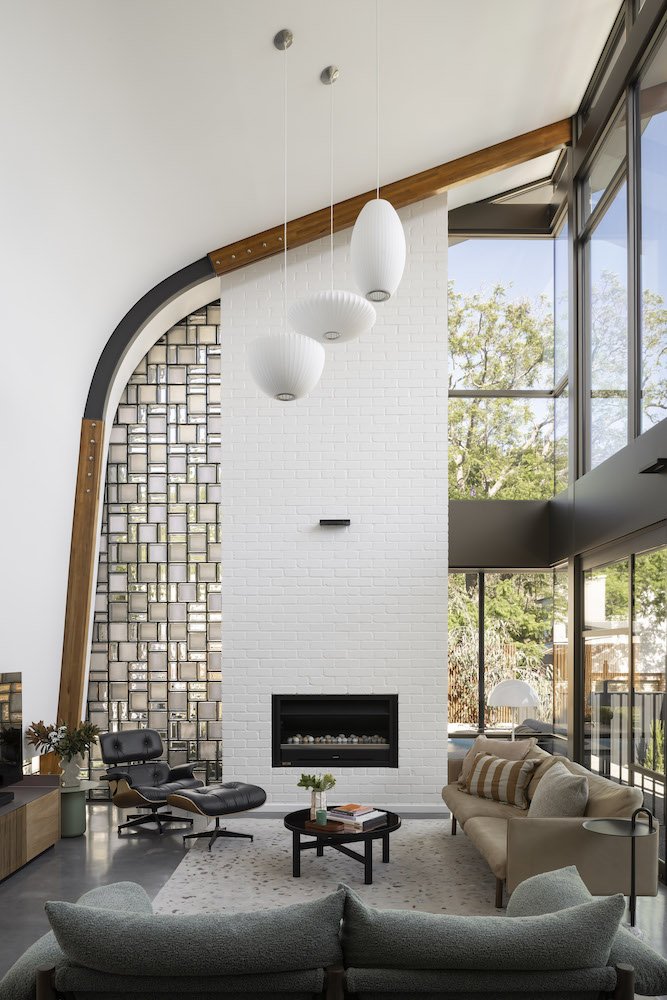
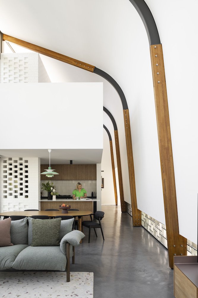
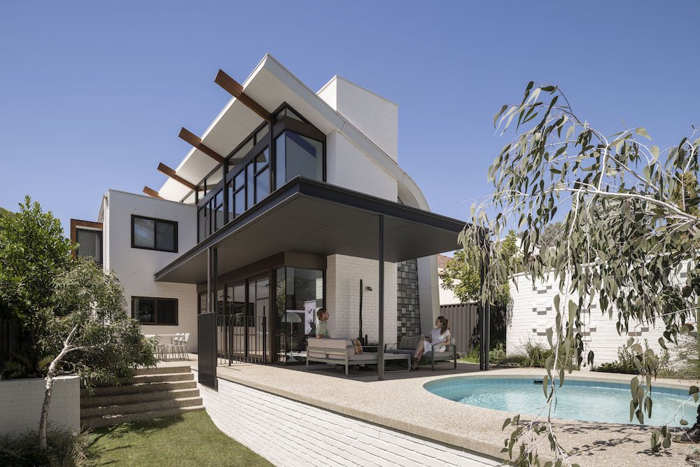
The bold and highly site-sensitive design comprises a masonry box that contains the family's private interior spaces, such as bedrooms, kitchen and laundry. A second element, a vast sculptural structure, embraces the more public areas – like the entry and stairway – and links to living and dining. Folding across the building, it touches the masonry element, bending through space from front to back and creating a light-filled, three-dimensional volume.
“I liked the idea of a building’s structure being elegant,” says architect Sam Klopper. “We celebrated our complex curve with timber beams linked by elbow elements, which provide expressive curves rather than bends. The glass blocks running along the base and curved shape make it feel like a beautifully curved shell.”
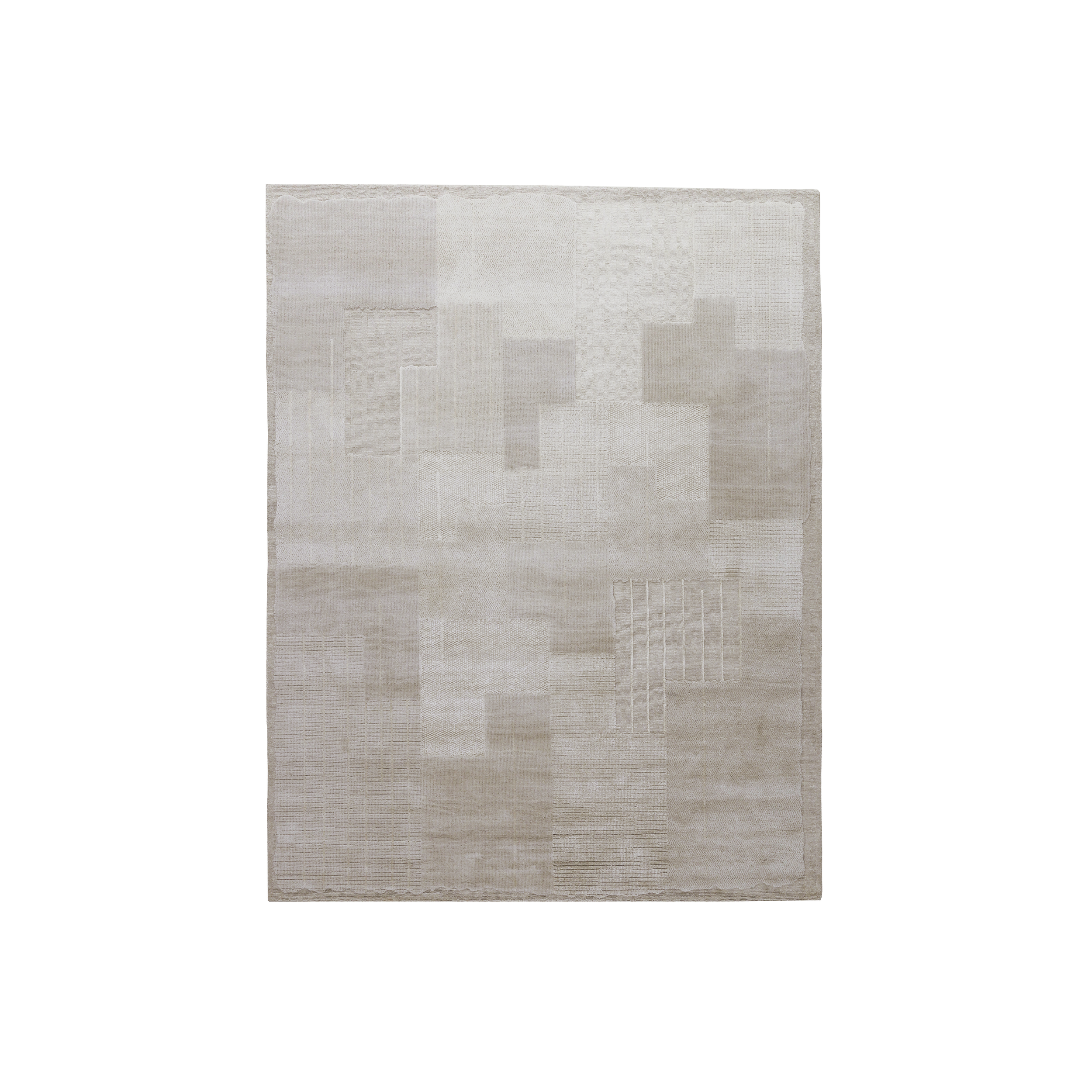
ABOVE: The walnut dining table is by Fritz Hansen and the chairs are original Danish Kai 42 styles reupholstered in Kvadrat fabric. The Wilfred sofa and cushions are from Jardan and the pendant is a Louis Poulsen PH 5. OPPOSITE: The Eames lounge chair and ottoman are from Living Edge, the Pensive lounge is from Innerspace and the Leo floor rug from Jardan.
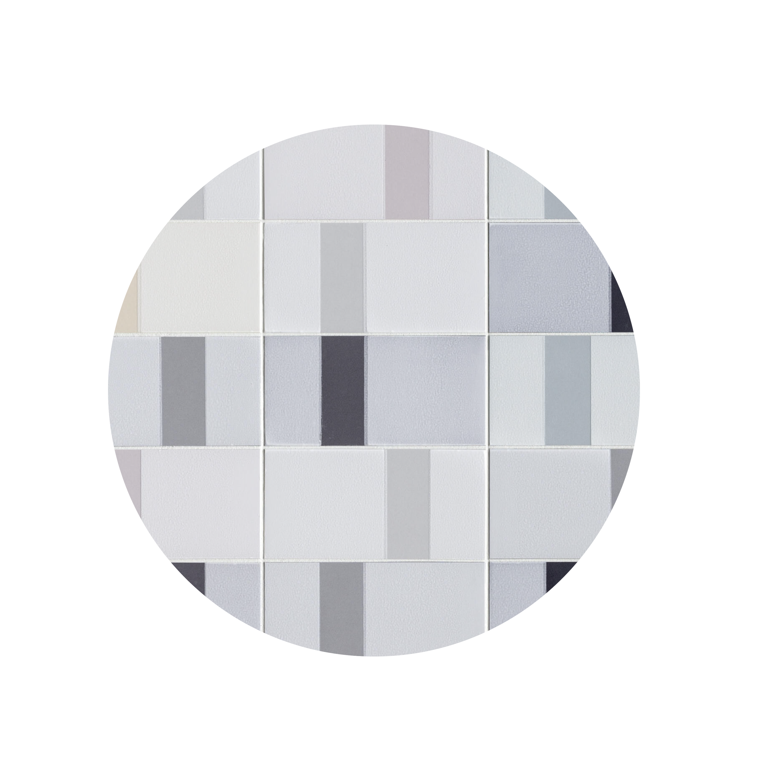
The kitchen includes cabinets crafted in Navurban Coolum Spotted Gum and Ravenswood from New Age Veneers, Brushed Kabuki black granite and Bianco Carrara marble from Bernini, and Wig Wag tiles from Myaree Ceramics. Hay’s Revolver stools are from Cult Design and the graphite black gas cooktop and oven are from ASKO.
The home's liveable spaces are a riff on the usual open-plan format. "The spaces that guests spend time in are generally well-lit, expressive and curvy with an openness to them," architect Sam Klopper explains. "We wanted something more dynamic, so these spaces are tighter, with smaller punches and openings for contrast. Moving from securely closed spaces to lofty areas and seeing that contrast is always dramatic."
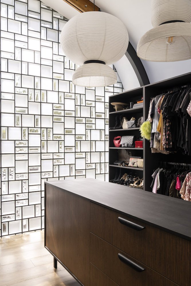
A wall of crystallised glass at the front of the home diffuses and fractures the morning sunlight that filters into the couple's music room on the ground floor and the dressing room above. Burnished concrete flooring flows throughout, chosen for its beauty, durability and patina that, with time, will become even earthier.
The sculptural, free-flowing cantilevered staircase constructed of steel and concrete features treads that appear to float off the wall as they ascend.
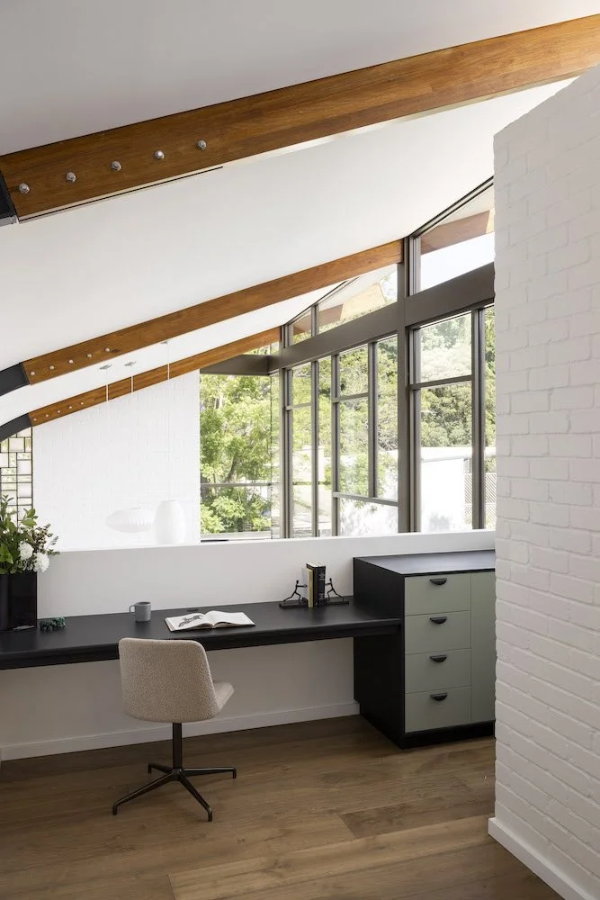
An office with a view. The desktop is made in Navurban Ravenswood from New Age Veneers and the cabinet fronts are Laminex Bayleaf with black stained timber handles from Kethy. The Swivel chair is from &Tradition. The floor is in Walnut from Woodpecker Flooring’s Signature Oak range.
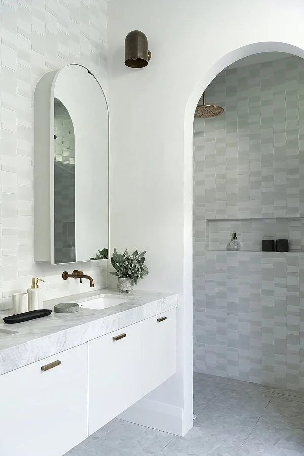
In the bathroom, tiles from Original Ceramics line the walls and floor. The cabinets are in Laminex Pewter, the oak handles are from Kethy, the benchtop is in Carrara Marble from Bernini, and the Vivid spout and mixer are from Phoenix Tapware.
The home's roof of classic terracotta tiles was reimagined into something "extraordinary", says Sam. "I wanted to take a suburban material with its own language and idea and twist it to make it interesting and contemporary," he explains.
Sam designed a wall that morphs into a roof and protectively folds over the house, the tiles forming a single folding wave that starts shallow and soars steeply as it twists dramatically from the front of the house to the back. "The builder wasn't sure it would work, but historic buildings, like Italy's duomos, show incredible forms can be created with tiles – I knew we could do it," Sam says.
With a beautiful park nearby, the garden was kept simple and minimalist. "It is landscaped in such a way that it will eventually create a backdrop for the home," says Sam. "We made the pool circular because it connects us to our suburban childhoods, and angular shapes tend to create tight moments – plus, kids can't make a whirlpool if it's rectangular!" Playful indeed.
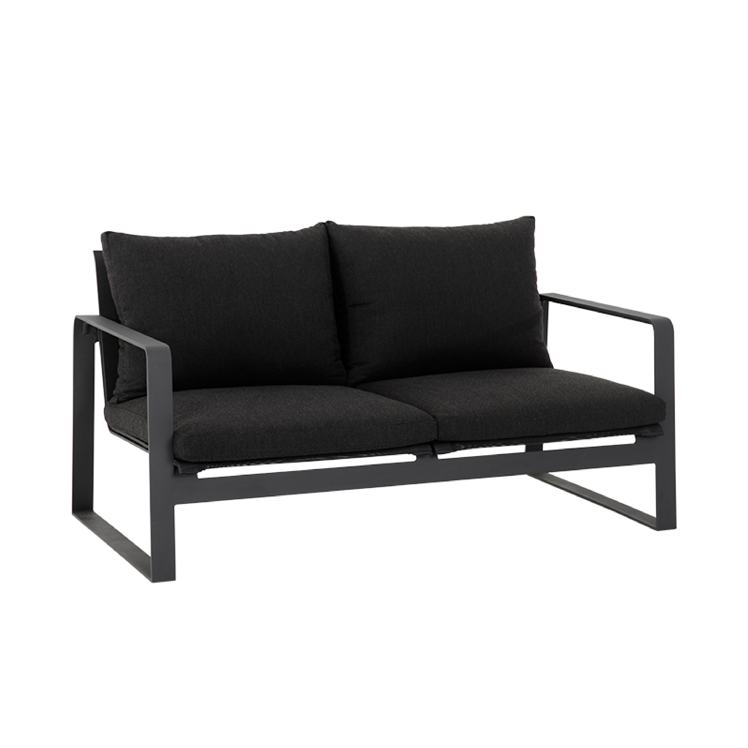
Pool time is made super-flash thanks to a Fermob Bellevie low table and chairs from Innerspace, styled with cushions from Jardan.
Simple, striking landscaping by Concept Origin elevates a classic circular swimming pool.
The family dines alfresco-style at a Palissade table and chairs by Hay.


