Union Street
With its all-white palette and accents of timber and stone, this charming Subiaco character cottage has been transformed into the family home of our dreams.
DESIGNER Daleki Design • BUILD + DESIGN ADVISOR FTB Design + Consult • PHOTOGRAPHY Jody D'Arcy • STORY Elizabeth Clarke
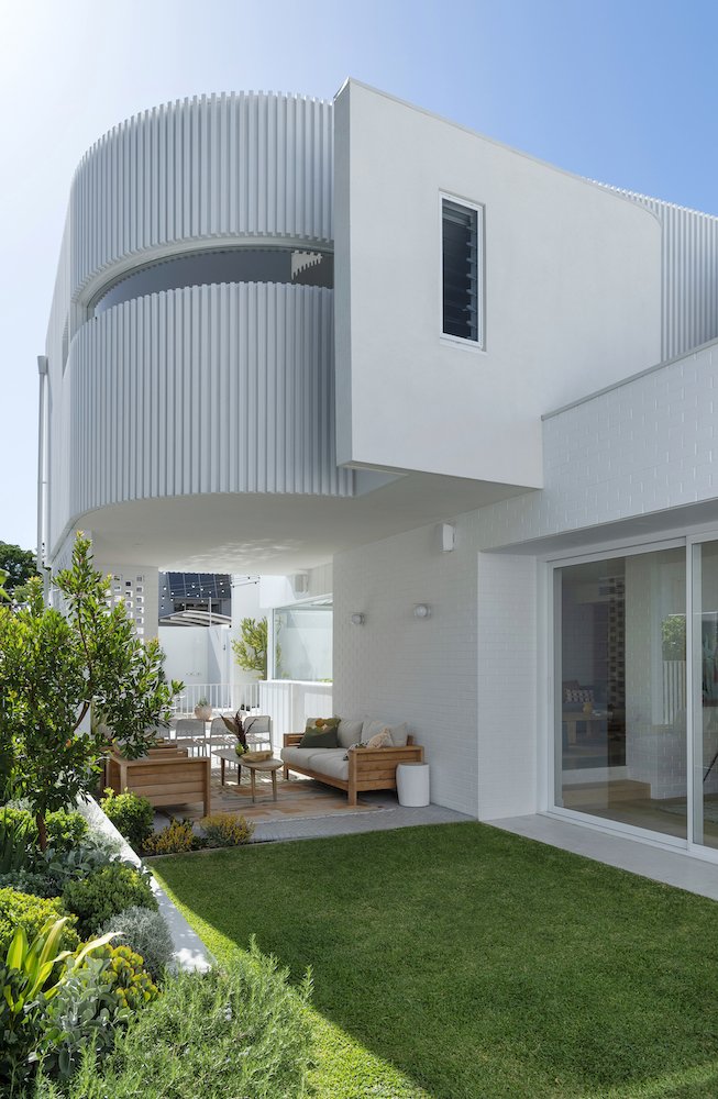
Beneath the upper-floor pod clad in white battens, an undercover area embraced in 70s-inspired breeze blocks creates the perfect external living space. The sofa and lounge chairs are from Eco Outdoors, the coffee table is from Empire Home and the tribal-style rug from Miss Amara. The Santorini white tub chairs by the pool are from Uniqwa Collections.
Felicia Brady's thoughtfully renovated heritage home, occupying 541 sqm on the higher side of Union Street in Subiaco, contains everything a busy family needs to live comfortably. Felicia collaborated with designer Janik Dalecki to create a timeless, high-functioning home that respects its early 1900s origins.
"Janik's style is completely different to mine; [his is] moody and contemporary, and I'm light, bright, and Malibu," she laughs. "We balance each other perfectly!"
Felicia runs FTB, a consultancy that advises commercial and residential clients on their projects, and she and her husband, Simon, are "serial house flippers". For their fourth project, they lived in their cottage while designing its extension.
"It was very dated with a 1980s add-on and needed gutting," Felicia says. "Its new extension simply needed to make the property comfortable for our family, not turn it into a sprawling house where you live separately. I like the tightness of a smaller footprint – it's homely when you can be together."
Felicia Brady's cleverly renovated Subiaco cottage showcases her love of heritage style and contemporary design.
Restoring the home meant starting from the front door and moving down its elegant hallway. The original lounge was reimagined as the couple's bedroom, with a simple arch added as access to the walk-in-robe (the site of the original kitchen) and generous ensuite. A large stone bath is lit by a skylight, and the space's materials embrace the original building's herringbone floors and solid oak timber cladding, creating "a wall of warmth".
External paving is repeated inside, and beautiful white painted cladding sits on either side of the hallway, concealing a laundry and guest bathroom – a favourite room of Felicia's. "I love the navy kit kat tiles and white tapware that pops brilliantly against them," she says. "The wall mirror is set off the wall, bringing it to life."
Seamless indoor-outdoor living is facilitated via simplistic design and vast glass sliders. The home’s outdoor lounge area is made comfortable and practical with a table from Freedom and Bora Bistro chairs from Hartley’s Outdoor Living (previous image). The wall sconces are from Beacon Lighting.
A touch of paradise in the back garden with simple hardscaping, lush cacti, and a seat with a water view.
Cool Palm Spring vibes.
On entering the new section, the ceiling purposely drops as you step into the kitchen and dining spaces and then shifts, soaring to its highest point. "It's a pause and sense of relief between the two structures," Janik explains. "Sometimes a transition between the old and new requires a bold approach because it is important to tell the story between the two."
Curves and arches from the original house were imposed in the new addition, which forms an upper-floor pod clad in white battens. Felicia's office and a garden are tucked behind it, with children's rooms nearby.
The semi-open-plan living spaces feature layers of textures in a white, bright palette that promotes a sense of unity. The flooring throughout is a combination of polished concrete and engineered oak boards by Woodpecker Flooring.
The main living areas have an open-plan feel yet offer degrees of separation. The kitchen and dining room share a space with a brick wall on either side that accesses the living room. The dining table is from The Wood Room in Melbourne and the chairs are from Have A Seat.
The kitchen's hero is its cloud-like marble splashback from Cosentino which punctuates seamless cabinetry banks made in melamine. The island bench features Porta timber panelling, with a sleek Cosentino benchtop. The stools are from Green Cathedral in Noosa.
Beneath the pod, a bank of 70s-inspired breeze blocks creates a chic external undercover living space. "I loved Janik's concept of white battens and brought them inside as floor-to-ceiling balustrades that cast the most beautiful light and shade in winter," Felicia says.
The original cottage floors were lined in jarrah, but Felicia wanted continuity between the old and the new, and good insulation. "The original boards were lovely but draughty, so we overlaid them with engineered oak which flows through the extension," she says.
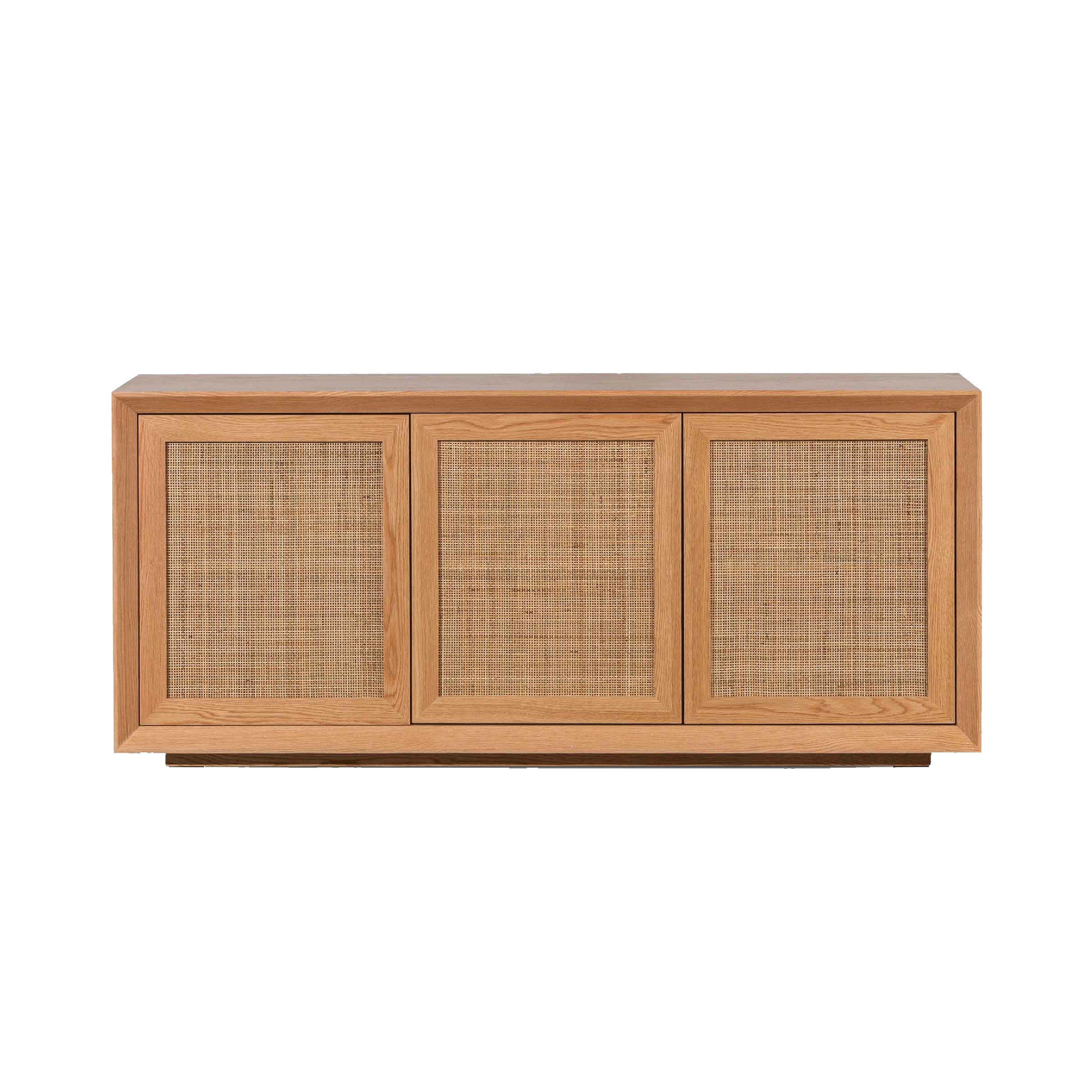
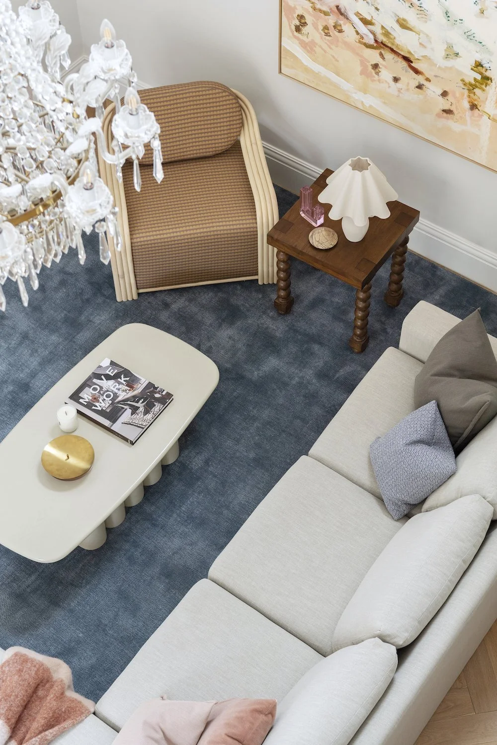
“I am obsessed with storage,” says Felicia of her cabinets made of Polytec in Nordic Oak. “I love timber but I choose to splurge in some areas and save in others. I was drawn to this material with its subtle pink hue.” The lounge room sofa and cushions are from Domain Gallery and the linen cushions from Adairs.
The main living areas have an open-plan feel yet offer some separation. The kitchen and dining room share a space with a brick wall on either side that accesses the living room. "We wanted some private and public spaces, so we introduced some screening in between," Janik says. "It allows a feeling of cosiness without feeling disconnected from everyone else."
The family eats in a space off the kitchen. A large, fixed window beautifully frames the garden, allowing natural light to illuminate the space. "In winter, the northern light streams in, hits the floor and heats the space, and in summer, the window's overhang prevents it coming in," Felicia says. "It really is the most perfect spot."
Felicia dressed her bed in a range of linens from Adairs and Bed Threads. The artwork is from Urban Road and the bedside table from Adairs.
A simple vignette in the master bedroom comprises a side table and chair from Brosa and chair from Uniqwa Collections.
A minimalist bath tub from Stonebaths anchors the bathroom, which also features floor-to-ceiling tiles from Trend Ceramics.
Felicia designed the bathroom cabinetry choosing Aries Natural finish by Laminex, a Cosentino benchtop in Silestone, and hardware by Linear Standard. The timber wall panelling by Porta softens the space.


