Floreat House
An art deco beauty reimagined.
INTERIOR DESIGN Sherwood Design • PHOTOGRAPHY Jody D’Arcy • STORY Elizabeth Clarke
Undertaking a fixer-upper can be daunting, but seeing a house transform from blah to beautiful makes the headaches of a renovation challenge worth it.
For Perth interior designer Gabrielle Sherwood from Sherwood Design, the opportunity to reimagine a beautiful Art Deco home in Floreat was an opportunity she couldn't refuse.
Tired but heaving with potential, Gabrielle was asked to breathe new life into its interior and exterior spaces and accommodate a home office and two busy teenagers.
The initial project didn't include structural changes, just reconfiguring its spaces and styling, and she is about to embark on a master wing for the couple.
Finding beauty in its past, Gabrielle used hedonistic flair combining colour, pattern and clever design elements to create a comfortable and glamorous home packed with ideas for social, work and enjoyable family living, inside and out.
The Staircase
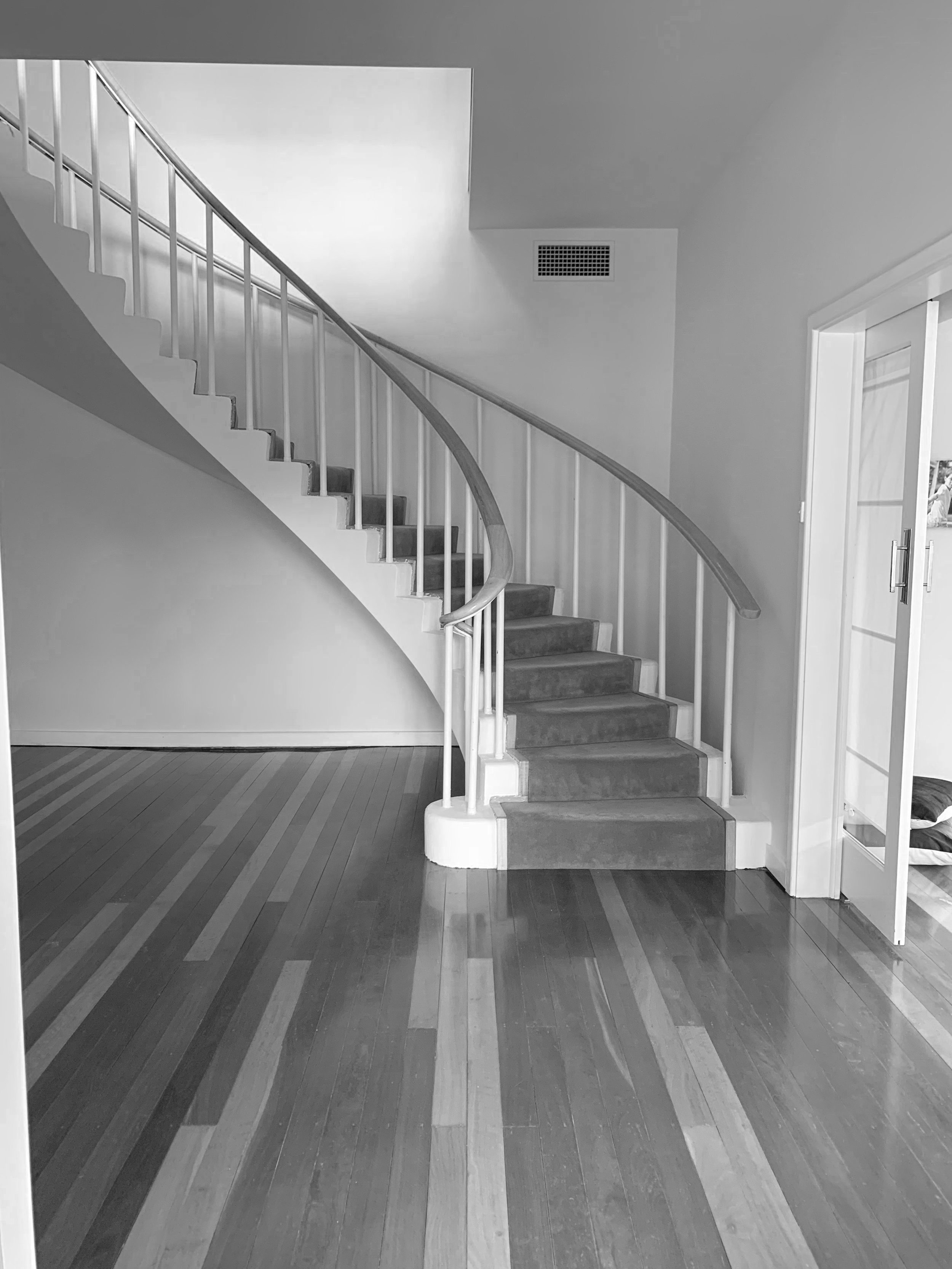
Gabrielle's vision for this dynamic and elegant space drew inspiration from its existing sweep of a staircase, the glamour of the 1950s, and the American interior decorator Dorothy Draper who was known for using exuberant colours and large-scale prints. The existing timber floors were patchy, and Gabrielle stained them Japan Black, allowing some of their former warmth to show. The stairs and skirting were painted in crisp Dulux Lexicon® Half, and the bannisters in a custom-tinted black paint for definition.
A custom wallpaper featuring lush green jungle leaves and bananas was inspired by 1920s French dancer Josephine Baker. It wraps the entire space, contrasting dramatically with a bespoke graphic carpet that runs up the staircase. "Mixing prints takes some confidence, but taking risks is important," says Gabrielle. "It looks very modern but is also very 1920s. A palette based around a natural theme tends to always work."
IMAGE CREDITS
Beneath the stairs, a client waiting area comprises two Arch Vanity chairs from Snelling Studio that are deeply padded and covered in rose pink velvet. A sculptural coffee table from GlobeWest contrasts with the dark floors, and a round rug, also from GlobeWest, grounds the space.
VIEW GALLERY
The Upstairs Landing
Black carpet adds depth and meaning to an otherwise sparse and small space upstairs. "Dark colours provide impact and diffuse natural light beautifully," Gabrielle says. "Black is also the perfect base for bright colours."
A pair of 1950s brass side tables featuring marble tops and Greek key patterns, a continuous line that folds back on itself found in the decorative arts from the Greek Empire, flank the doorway. Gabrielle added graphic brass mirrors above each and bright pink lamps for a sense of playfulness.
IMAGE CREDITS
The pair of brass-legged side tables, pink lamps and mirrors were sourced from James Said.
VIEW GALLERY
The Home Office
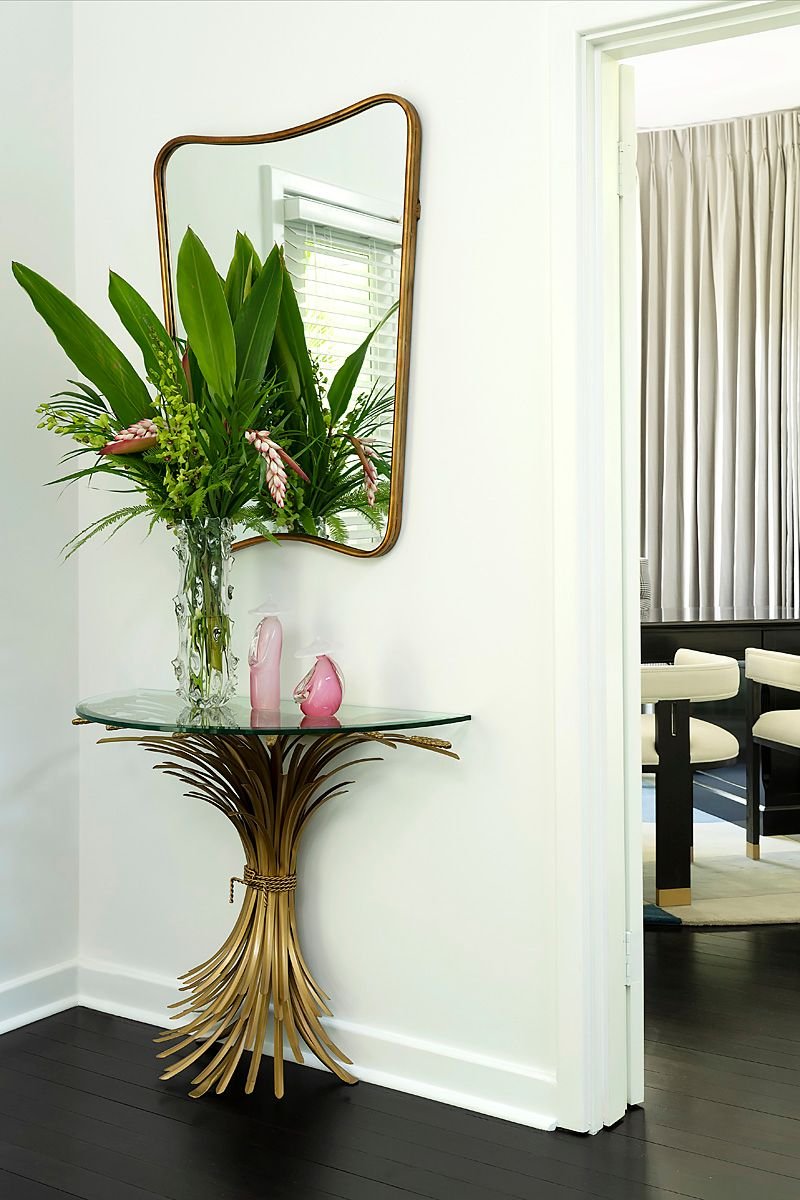
Before entering the office space, a beautiful side table catches the eye. Featuring a gilded metal sheaf of wheat, similar to one designer Coco Chanel had in her elegant Parisian apartment, it provides subtle glamour and a sense of arrival.
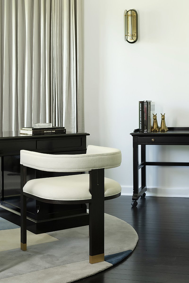
The office had good bones, says Gabrielle, who allowed its architecture to give way to elegant styling, resulting in a space that is as beautiful as it is functional.
"Before, it was a sea of misty brown and looked like something out of a 1980s soap opera!" recalls Gabrielle. "I took my concept from the existing curved window and looked for circular, square and geometric references in the furnishings, from the round floor rug to the curvaceous visitor's chairs."
The room's focal point is a generous dark, ebonised oak desk and houndstooth printed chair. Wall embellishment is sparse except for a wall of custom grey curtains, a sculptural wall sconce and a painting of the client's father, which Gabrielle had restored and reframed. A customised sideboard designed as a computer mobile now acts as a bar trolley. "Very Mad Men and just as useful," laughs Gabrielle.
IMAGE CREDITS
The office entryway's gilded metal 'wheat' side table is from James Said, as are the desk and chairs. The customised cabinetry is by Sherwood Design, as is the former computer side table, now a bar. The wall sconce is from Snelling Studio.
VIEW GALLERY
The Teen Living Room
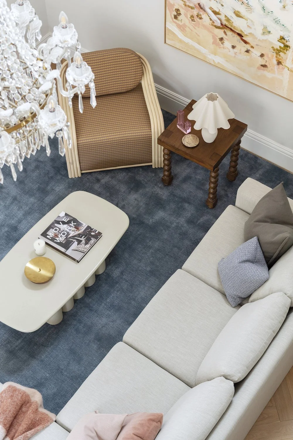
One of the most used spaces in the house, a living room must be warm, comfortable and stylish – and when it's built for teenagers, it must stand up to constant use. Gabrielle says that this tired, dated space needed more than a little refresh - it required a total makeover.
The space's palette borrows from a work by Australian artist Dina Broadhurst, who combines photography, digital collage and dramatic 3d elements to create her bold stylistic imagery that embraces fashion, art and design. Gabrielle painted the walls white, which bounces light around the space and showcases the artwork.
A vast graphic floor rug in soft colours adds subtle depth and dimension and references the nearby stairwell's dynamic runner.
Cabinetry features on both sides of the room, one with an integrated fridge and the other solely reserved for storage. A custom fold-out bed is perfect for sleepovers. Covered in a robust velvet-like fabric, it's super durable, allowing coffee or red wine spills to be easily washed out. A hanging chair adds scale to the space, and a pair of luxurious velvet-covered stools provide extra seating.
IMAGE CREDITS
Teen dream. A pretty, playful photographic work by Dina Broadhurst lays the groundwork for the space's palette and mood. Equipped with a Uniqwa swinging chair, a custom sofa upholstered in resilient Zepel Fabrics fabric and handcrafted velvet ottomans from Darcy & Duke means the room is always party-ready. The bespoke cabinetry is made by Sherwood Design, and the Rug Culture floor rug ties all the room's elements together.
VIEW GALLERY
The Pool Area
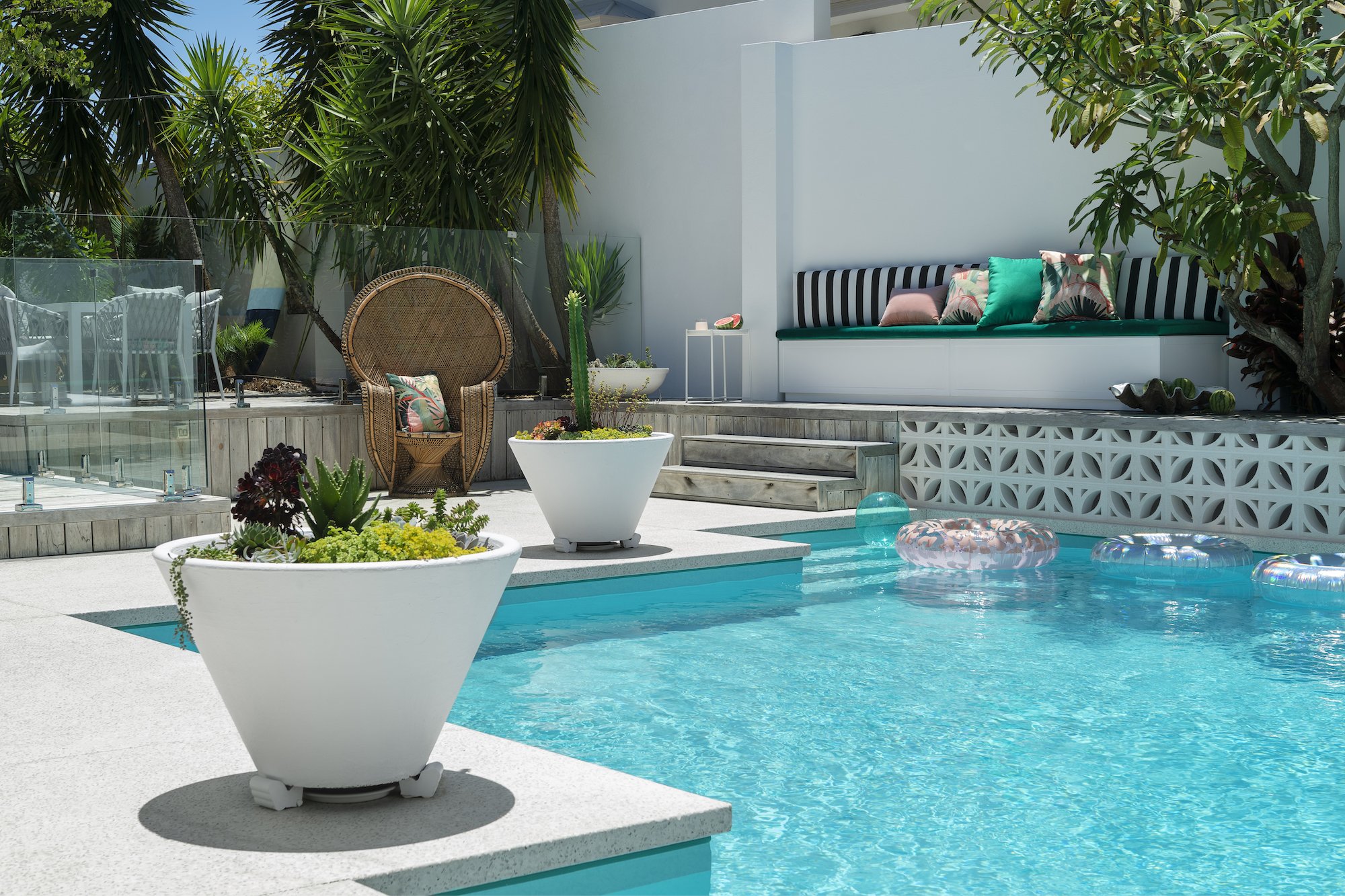
The pool area was tired and sparse but held exciting possibilities. Channelling Palm Springs glamour, with its vibrant colour, glittering pool, and sun-soaked elegance, Gabrielle installed breeze blocks, a bar trolley and cosy built-in nook seats upholstered in outdoor velvets and punchy patterns.
The space also includes alfresco dining making it the family's playground for summer cocktails, colourful parties and poolside get-togethers.
IMAGE CREDITS
The bar trolley and chairs are from GlobeWest, and the dining table is from Satara. The peacock chair is a vintage find, and the delicious jungle print cushions are made in Tropicalia fabric by Catherine Martin by Mokum.
VIEW GALLERY
The Balcony
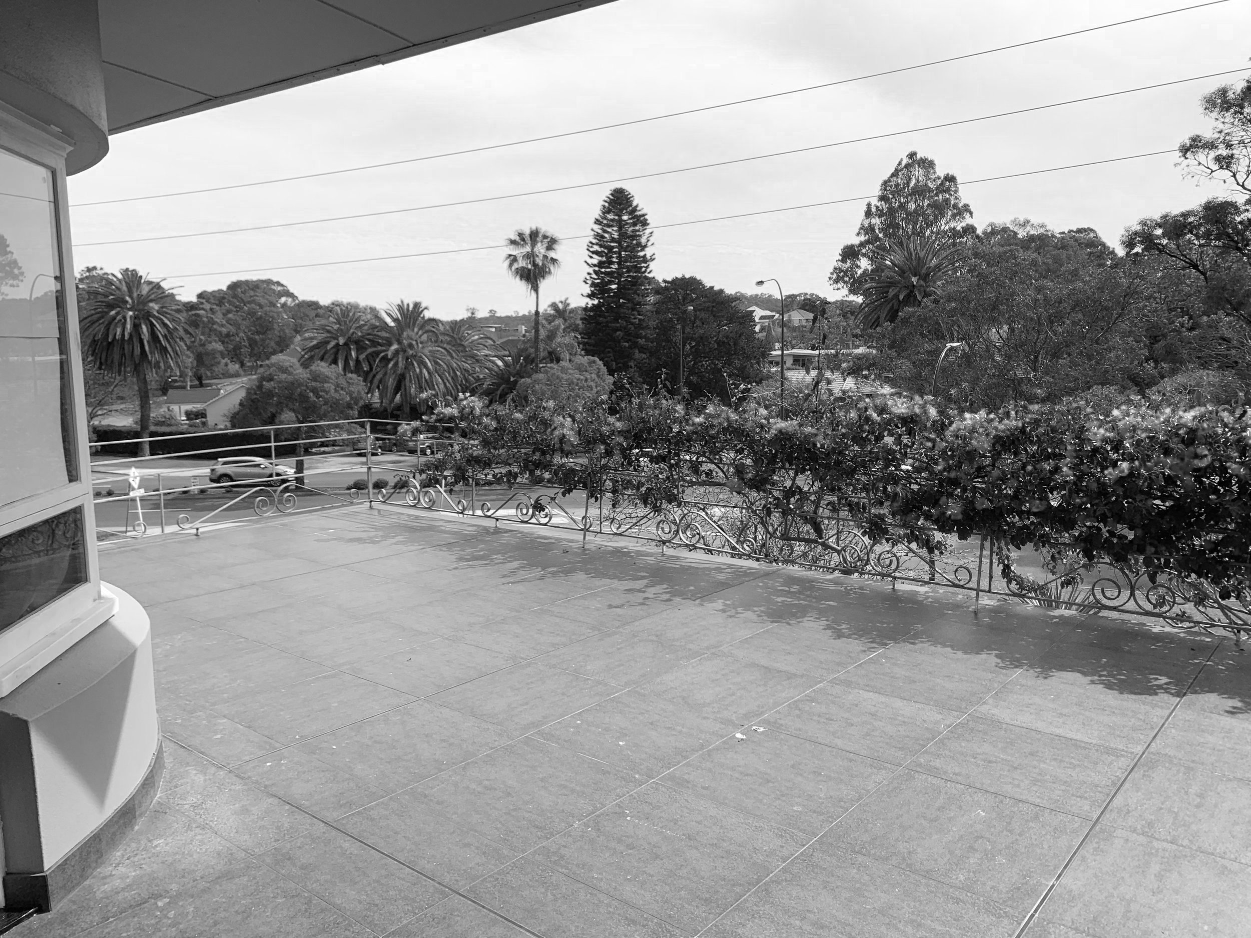
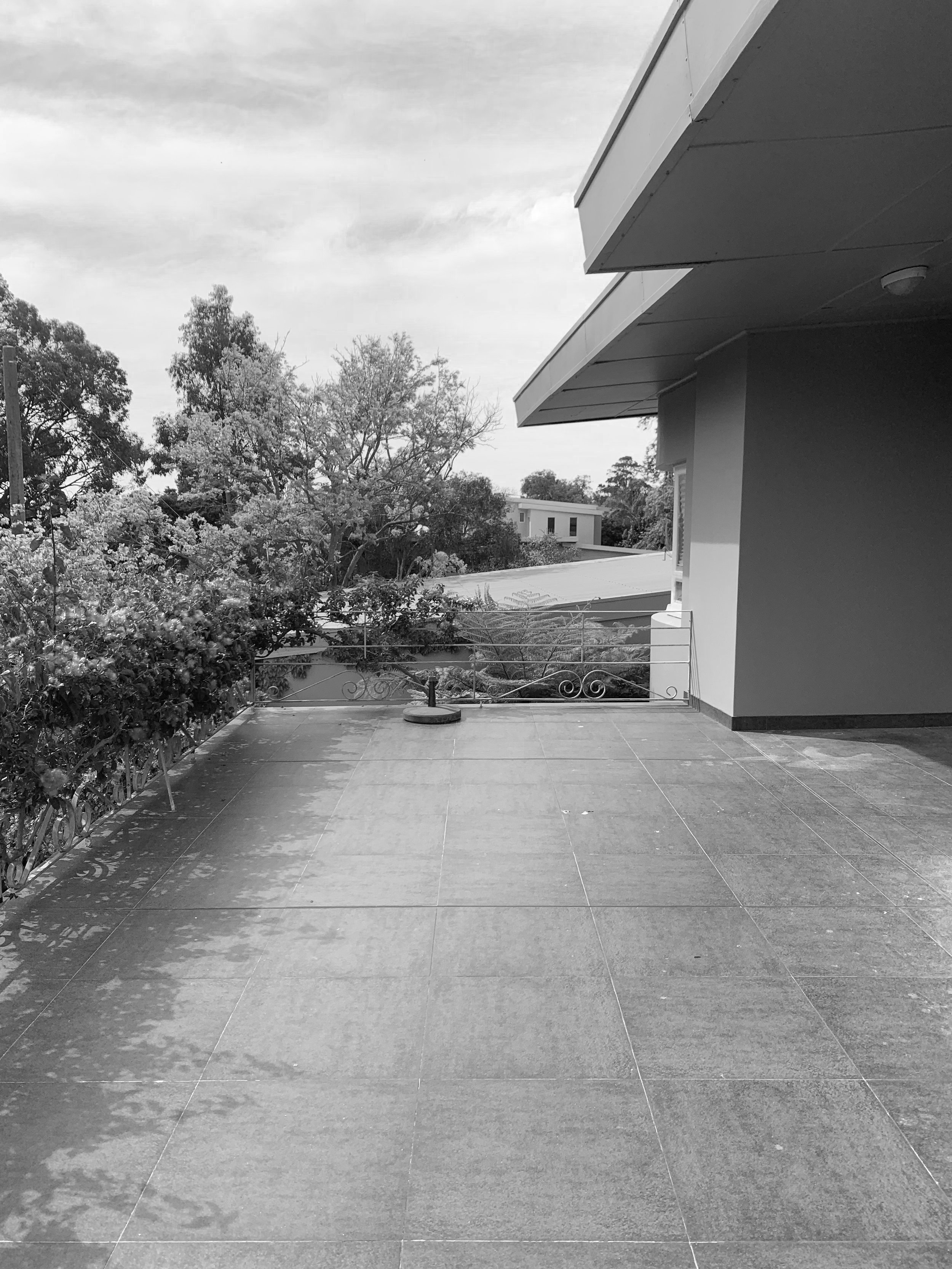
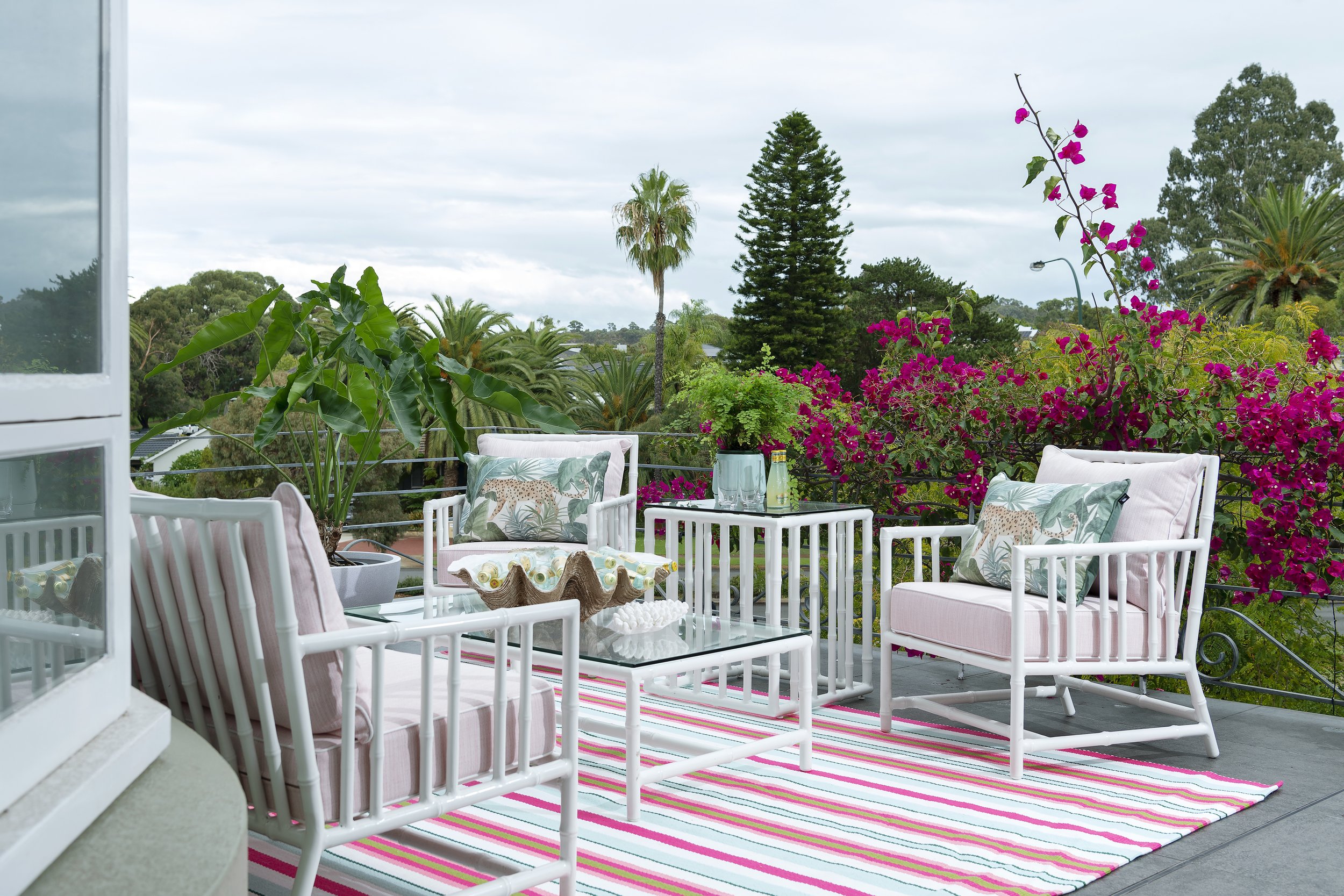
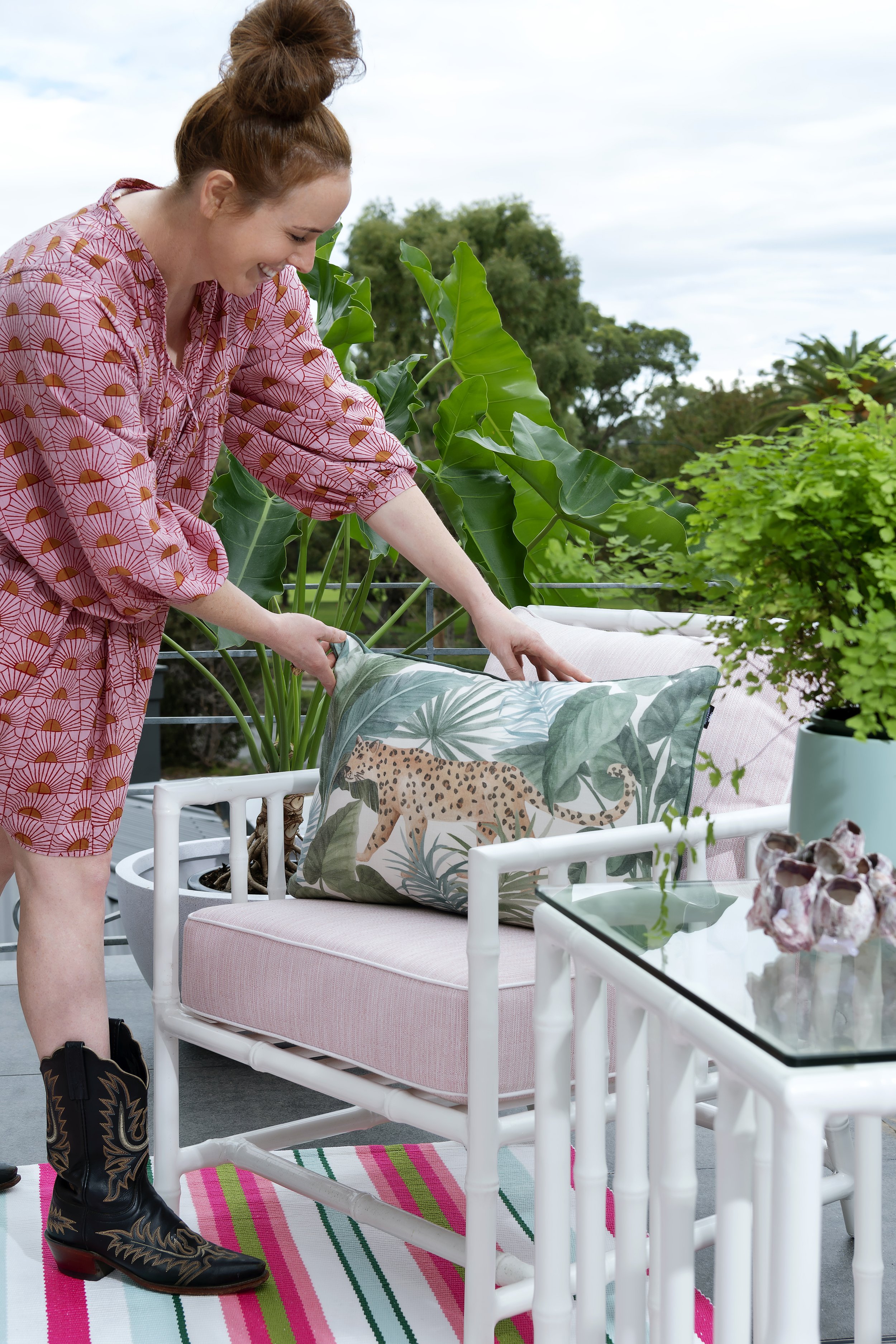
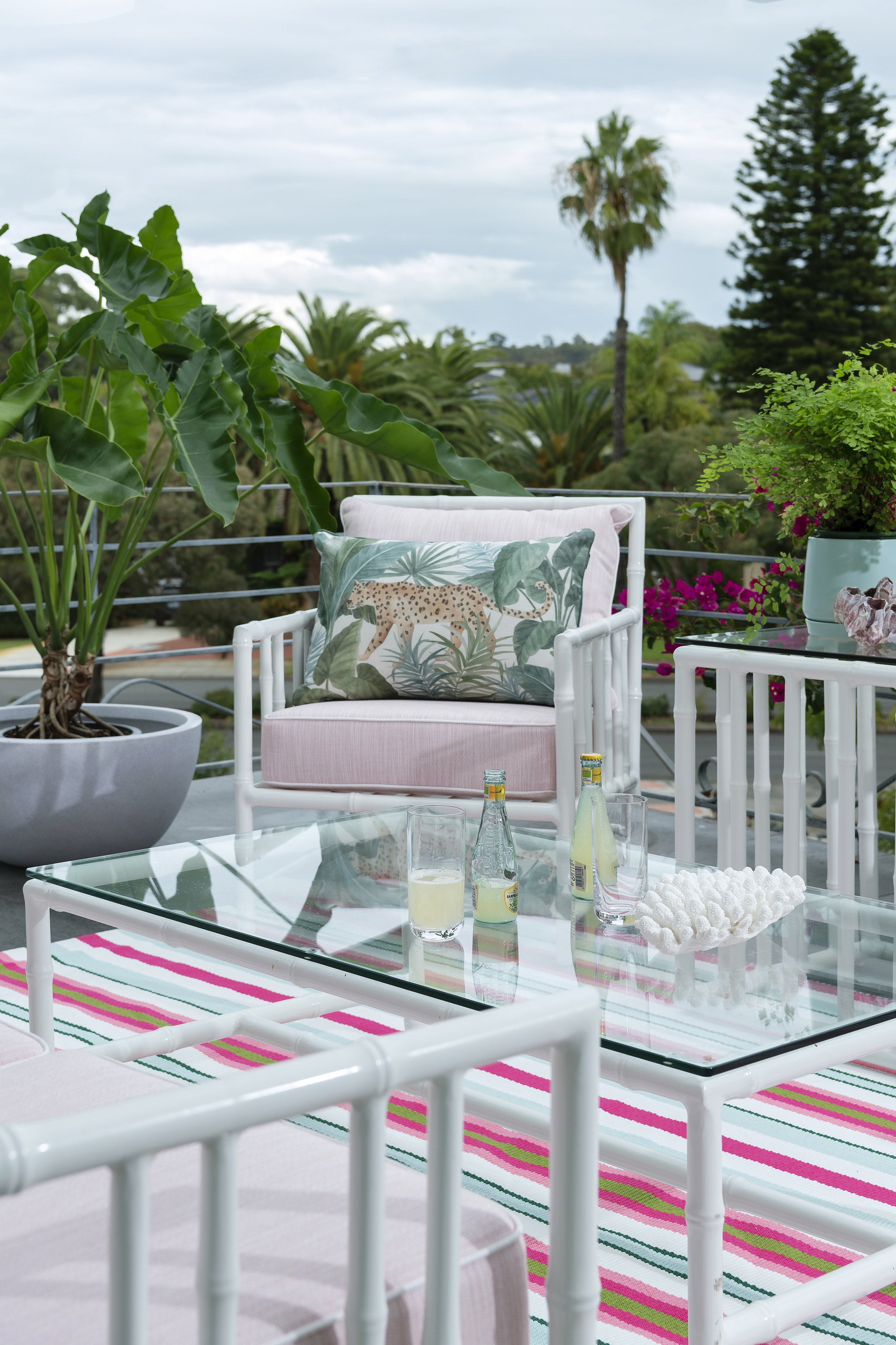
"Leopard is the new black," Gabrielle says of her choice of soft furnishings on the chic upstairs balcony. The space was previously tiled and empty but is now a cheeky and vibrant overflow space used by the couple's teenagers for entertaining.
Its leafy park outlook, towering trees and shock of hot pink bougainvillaea informed Gabrielle's palette choice. A candy-striped outdoor rug marks out the area comprising cane-look aluminium outdoor furnishings. "We customised the covers in pale pink with white detailing and added some leopard print to the mix," she says.
Gabrielle's go-to styling piece, an oversized clamshell, sits on the coffee table. "It's made of polyresin, so you can fill it with ice, oysters and champagne or use it for a fruit arrangement," she says. "It's versatile, and a conversation piece, and I'm obsessed with it."
IMAGE CREDITS
The outdoor cane-look furniture is from Alboo and the floor rug is from Winton House. The clamshell is from Sherwood Design.

