Rock Star
A luxurious Dalkeith kitchen renovation amps up the drama for everyday pizazz.
INTERIOR DESIGN Emma Hann Interiors • PHOTOGRAPHY Jody D’Arcy • STORY Elizabeth Clarke
The kitchen in this classic Tuscan-style Dalkeith home was crying out for a more modern slant, and while its location was destined to stay, it was in dire need of an upcycle.
Instilling the U-shape configuration with renewed functionality while not changing its footprint was designer Emma Hann's modus operandi.
"The owner is a fabulous cook and entertainer, and with her children now all grown up the kitchen needed to adapt to its changing role," Emma tells Havenist. "There was a coffee machine, appliances and large cooking utensils taking up valuable bench space, and a top priority was making the island bench more user-friendly. The owners were worried it would consume too much space, but I knew it would make it more practical and welcoming for entertaining."
The fridge was swapped from the right-hand side to the left, providing space between other integrated appliances, and a large step-in pantry was installed next to the bank of Neff ovens, instantly liberating more bench room.
Storage was a critical issue, with appliances galore and benchtops a dumping zone for car keys, paperwork and bags. Lacking a scullery or secondary utility area, Emma designed two ample appliance cupboards and generous storage for lesser-used items that now extends to the ceiling. An unsightly air-conditioner was concealed within the joinery and is operated via a remote control. The island bench was extended and integrated with a wine fridge and more storage space, accessible from every angle. "For miscellaneous items, we installed shallow drawers on the bench’s busiest side so everything has its place, which keeps the surfaces clear and uncluttered," says Emma.
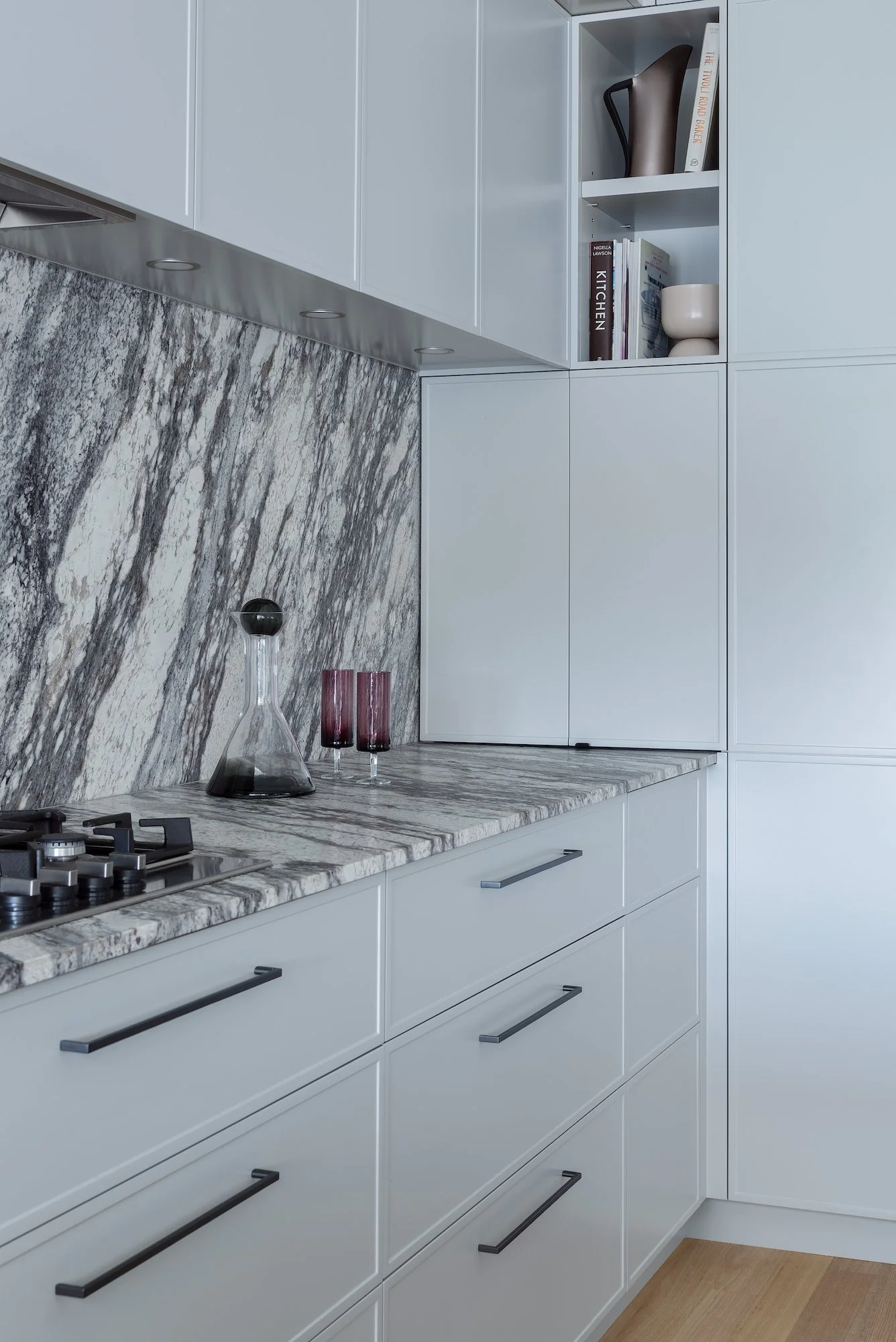
While extraordinarily functional, the space is anything but ordinary thanks to the 2Pac joinery’s cool grey tone with a hint of sage and swathes of wildly veined granite. Dramatic in black and white with a leather-like touch, it washes over work surfaces, the island bench, and most dramatically across the splashback.
"We considered marble at first, but we didn't feel it would be as practical or user-friendly in this application," says Emma. "This granite is tactile and textural and incredibly resilient. The splashback is the hero, and the fabricator did a beautiful job ensuring the veining was consistent in the slab."
To anchor the scheme, the once golden-toned timber floor was stripped and lightened up, adding warmth to the space. A large window above the sink, overlooking the tennis court and pool, draws in natural light.
A set of Grazia&Co. Iva stools from Loam has transformed the island bench into a space for family and friends to gather. Bronze detailing on the footrests adds sparkle to the space. Embellishment otherwise is minimal, with coffee accoutrements by Tom Dixon and artisanal vessels by Loam displayed on a bench. Favourite cookbooks and Mud ceramics in subtle shades of lemon and butter are placed carefully in open shelving.
"There is fantastic artwork throughout the house, so we deliberately kept the kitchen very understated," says Emma. "There is no pendant or statement lighting, just downlights. It's a beautiful, timeless space with functionality that doesn't need much else. There is also enough going on with that stone – it is absolutely the star of this show!"
The quiet grey cabinetry is detailed with minimal hardware and a subtle profile line. Emma squeezed storage and shelving into every available space.
Cooking essentials, ceramics and collectibles by designers including Tom Dixon and Mud Australia are displayed on benches and open shelving, and are the only embellishments needed in this glamorous space.
"It's a beautiful, timeless space with functionality that doesn't need much else. There is also enough going on with that stone – it is absolutely the star of this show!" -EMMA HANN
"This granite is tactile and textural and incredibly resilient. The splashback is the hero." -EMMA HANN


