Modern Muse
A bold palette of finishes lends depth and definition to this midcentury-inspired Cottesloe kitchen.
INTERIOR DESIGN Jess O’Shea Designs • PHOTOGRAPHY Jody D’Arcy • STORY Elizabeth Clarke
Designer Jess O’Shea has ushered in a stylish Cottesloe kitchen’s second act, rooting her design decisions firmly in midcentury style.
The more minimalist predecessor to the excessive glamour of the 1980s and the whimsical styles that came before it, midcentury design has true staying power. Spanning 1933 to 1965, it prioritised simplicity, clean lines, natural elements and functionality, making it a style perfect for the contemporary kitchen.
“It’s a bold style you need to feel passionate about to apply to your home,” says Jess. “There are different midcentury styles – such as Palm Springs and traditional – you can choose from, and certain aspects of it, like lots of timber and pops of colour, are simple to adopt.”
For this eight-year-old midcentury-inspired home, Jess was handed a blank canvas. She says while its “bones were there” and the kitchen was in relatively good nick, its mushroom-coloured cabinetry and impractical layout needed work.
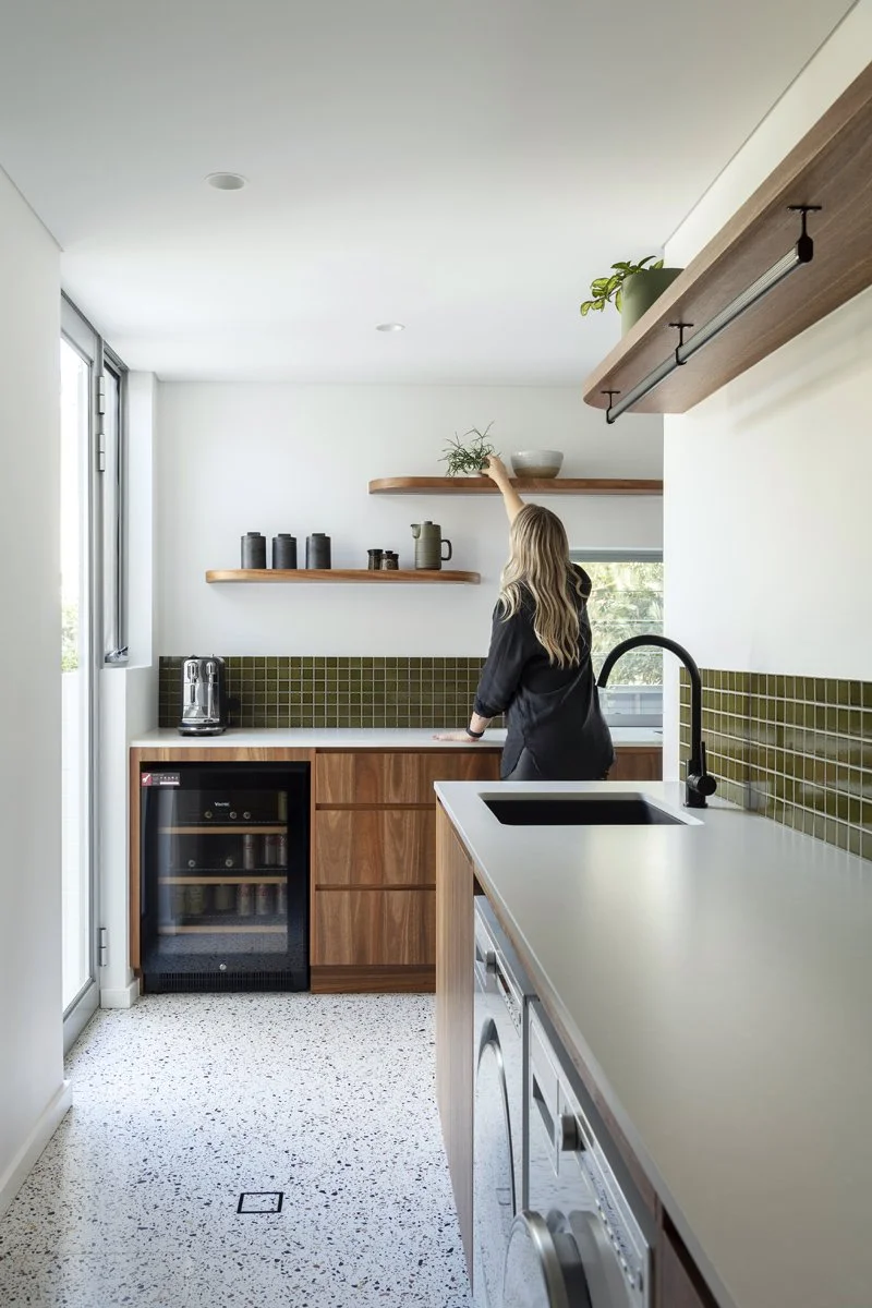
Rendering a more functional layout, Jess created a cook’s kitchen, complete with a generous island bench, double oven, generous storage, a large integrated fridge and a fluted glass spirits cabinet. Behind it is a hard-working scullery and laundry with a large walk-in pantry with beautiful timber shelving, a generous double sink, wine fridge, fully integrated dishwasher and lots of storage.
The kitchen is nostalgic yet contemporary with its purposefully period-correct material palette of green tiles and Spotted Gum veneer.
“The brief was for a strong midcentury feel and lots of colour,” Jess says. “We wanted a more timeless feel, which meant making the whole space timber.”
The boldest part of the composition is the island bench wrapped in vertical timber battens. Jess packed it with storage on one side and suspended it off the ground, allowing light to flow beneath it that helps illuminate the space.
The lino floors in the scullery and laundry, and timber boards in the kitchen, were replaced and enriched with terrazzo that delineates the kitchen from the living areas and provides pause in the timber-dominated space.
“Some people find layers of timber polarising, but when you are in the space, it’s brightened by the white walls in the adjoining living and dining areas,” she says. “When natural light is filtering in on a cloudy day, the change in light levels is amazing to watch.”
The space’s ambience is buoyed by artisanal, organic objects that subtly elevate simple surfaces. Embracing the sleek minimalist qualities so loved in midcentury designs, Jess has created a bold, confident kitchen that proves minimalism can be warm, inviting and contemporary.
The island bench features curved edges that mirror those of the framed rangehood. Jess replaced the timber floors in this space with characterful terrazzo.
In keeping with the kitchen’s midcentury feel, Jess designed a tall spirits cabinet with a timber and fluted glass door. The curved terrazzo floor artfully zones the area from the adjacent living spaces.
The scullery includes generous storage, a wine fridge, an integrated dishwasher and a microwave. The laundry’s washing machine and dryer are tucked out of sight beneath the bench, and above is a Franke sink and Abey goose mixer. All available from Hart & Co. The scullery is swathed in Spotted Gum veneer that conceals cupboards, drawers, appliances and a pantry. A bank of louvres draws fresh air into the space.


